Showing posts with label 6025 Fear Not Set. Show all posts

Sunday, July 6, 2025

Water of Life and Hiker Foundation by Karen Day

 Hello Ai Watercolour fans!


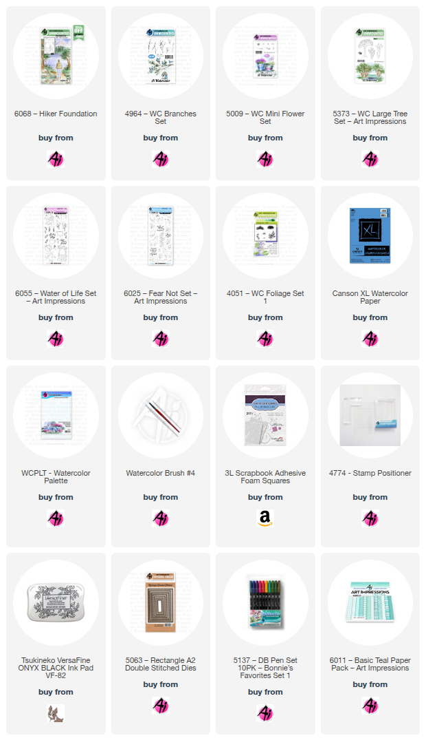
My first card is using one of the newly released Scenic Foundation sets that have more of a masculine feel to them.  This is the 6068 - Hiker Foundation set.


Using my Misti, I stamped the image onto my Canson XL watercolour paper using Tombows #969/565.  *With a larger image like this, it helps to use a stamping platform, as you can reink and stamp it a second time if your first impression isn't perfect.  Before stamping the foliage, I painted light shades of #565 on the mountains, getting a little darker for the hills in the foreground.  I was aiming for some striking contrast, so used #346 to paint in the two closest bits of land.  I wanted a bit of a sunset sky, so I started by mixing #991 and #856 to give me tones of yellow and peach.  I echoed the same colours in the water, reflecting both the mountains and the sunset.  I added streaks of darker tones to the water to make it look like ripples on the lake.


The grass in the foreground was painted with a wash of #177, and layers of #992 were painted on the pathway.  The two main trees were painted with streaks of #992/969/947, as were the edges of the pathway under the grass overhang.  After pulling out the colour of the rocks with my damp brush, I added more shades of N52/565/992 to the stones, creating contrast between the rocks.  I used the foliage stamp from 5373 - WC LG Tree Set and #177/249 to stamp the foliage on each of the trees, turning the stamp so that it would appear irregular.  I touched the foliage with a damp brush to soften it, and added in a few darker tones for shadows.  I used the tiny sprig from 5009 - WC Mini Flower Set and #177/346 to add a few low shrubs in and around the trees and rocks, then added a few branches from 4964 - WC Branches Set in #969.  A little grass was added in #177 using the small grass from Foliage Set - 4051.


I painted the hiker in coordinating colours #565/992/177/969, other than his bright hat in #856.  I hadn't painted in the sun before I added the foliage (should have!), so I just dabbed some white at the edge of the mountain, and then painted some white streaks into the water to indicate the sun.  White paint was also used to add in some flowers on the shrubs.  As a final touch, I used my paint brush and #346 to add a line of pine trees to one of the hillsides.  The image was die cut with the 5063 - A2 Rectangle Double Stitched Dies, matted with a warm brown, and adhered to my base with 3D foam adhesive.

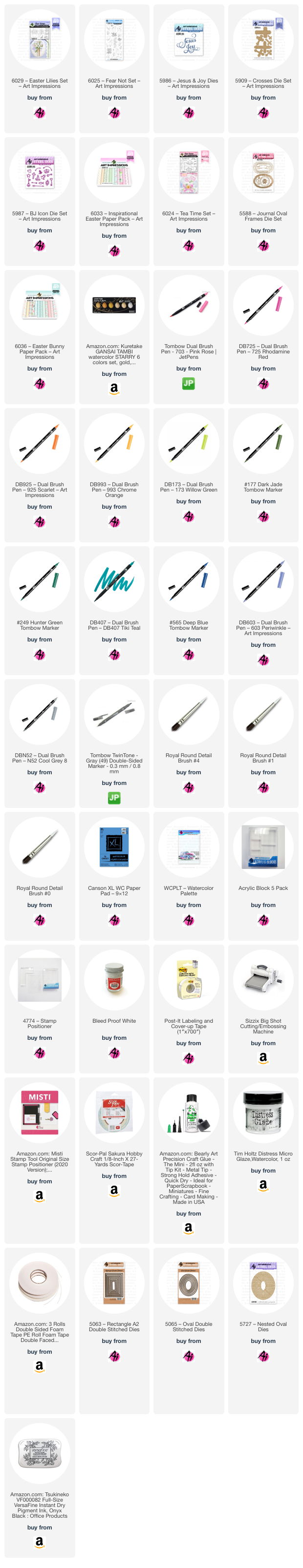
My second card is using two of the new sets from the Bible Journaling line.


I die cut my Canson XL watercolour paper with the 5063 - A2 Rectangle Double Stitched Dies, and stamped the sleeping lamb from 6025 - Fear Not Set using #969/565.  After masking him, the stone well from 6055 - Water of Life Set was stamped behind him.  I pulled out the colour from the lines on the well, concentrating the colour where shadows would be - then added more N52/565 to darken the stones.  On the lamb, I added #850 to his ears and nose, and painted it as a wash over his fleece, to add a little warmth.  N52/565 were used for shadows, and to add some dabbled texture to indicate the fleece.


#126 was painted as a wash for the grass, and #493 done as a wash in the sky.  The two long grass stamps from 6025 were stamped around the well in #177, and two of the floral images were stamped in #177/856, on either side.  The small grass from Foliage Set - 4051 added a little texture in #177 around the bottom.  I used a light version of #565 to paint the bird, and touch some pale orange to his beak.  I used my black Twintone marker to darken the eye of the bird, and those of the lamb.  My grey Twintone marker was really helpful in redefining the lines of the well that had blurred a bit after painting, and for darkening the bird's legs.  Since I don't have a lot of luck in spattering paint on my images, I used the grey Twintone to add little dots around my image to suggest a little texture in my painting.


The sentiment is from the retired Exclusive Daisy set from several years ago.  I added a grey mat to my painting, and adhered it with 3D foam adhesive to my base which is paper from the 6011 - Basic Teal PP.

Sunday, April 20, 2025

May the Joy of Easter be Yours and Happy Mother's Day Cards by Diane Mason

 Hello, and welcome back for Watercolor Weekend!

Happy Easter, Ai Watercolor Friends! I hope you are having a joyous weekend. I have two watercolor cards to share with you today. The first is an Easter card and the second is a Mother’s Day card.

May the Joy of Easter be Yours Card:

Recently, I’ve seen multiple versions of Cross Pop-up cards online, but none yielded an A2-sized card. So I decided to create my own. Since it is Easter Sunday, you probably won’t be creating this card today, but maybe an idea for next year? I think this design would also make a lovely Confirmation or Sympathy card. If you like this design, you can bookmark this page and save it for future reference.

To create an A2-sized card, I used the following measurements, shown in the photo below, for the pop-up. All of the elements will get attached to an A2 card base (8 ½ x 5 1/5 inches, folded in half).


As shown above, I cut a piece of light purple cardstock, sized 5.5 inches by 5.25 inches. Using a scoring board, I scored the cardstock at 1.5, 2, 3.25, and 3.75 inches to create the pop-up piece. Next, I adhered the patterned paper pieces (6033 – Inspirational Easter Paper Pack) to the pop-up base, leaving an even border in each section. I folded the pop-up piece on the score lines to create the raised area in the center. Then I adhered the pop-up base to the front of the card base. I started on the left side and lined-up the left edge with the fold of the card base, and continued across the card. To maintain the pop-up, I matched the right edge and adhered it in place. I then pressed the pop-up flat to be sure it would lie flat to fit in an envelope. I then adhered the patterned paper to the cross piece (3.25 by 1.25 inches cardstock piece). I waited to adhere this piece to the pop-up until my painting was finished, die-cut, and matted.

The image of the pot of Easter Lilies is from the recently released 6029 – Easter Lilies Set. I inked the pot with 603 and the lilies and leaves with 177 and stamped them onto my Canson XL watercolor paper. I pulled some color from the leaves and added more 177 from my palette. For the highlighted areas of the leaves, I applied a mix of 173 and 177. I used 565 to shade the white flower petals and added 173 to the centers. Once dry, I painted in the flower stamens (177 for the filaments and 925 for the anthers) with a 0-round brush. I painted the pot with 603, leaving the center lighter to give the pot a rounded shape. Shadows were added with more 603 and 565. White stripes were added to the pot, using Dr. Ph. Martin’s Bleed Proof White. I brushed in a watery mix of 407 for the background and 565 for the shadow under the pot.

I die-cut the painting and mat with dies from 5065 – Oval Double Stitched Dies and 5727 – Nested Oval Dies. I then adhered the cross piece to the back of the center of the ovals. I pressed the pop-up flat to the right, lined up the edge of the cross piece with the edge of the card, and adhered it in place. When adhered properly, the card will lie flat and fit perfectly into an A2-sized envelope. I inked the Happy Easter (6029) sentiment with Versafine Onyx Black ink and stamped in the bottom right of the card.

For the interior of the card, I inked the “May the joy of Easter be yours” sentiment (6029) with 603, and stamped a couple of times to darken, using a stamp platform. I did the same with the flowers from 6025 – Fear Not Set.

With Joy on my mind, I decided to create a little bookmark to tuck into the card. I die-cut the decorative cross (5909 – Crosses Die Set) three times from metallic gold cardstock and adhered them together to give the cross some thickness. I die-cut the Joy die (5986 – Jesus & Joy Dies) twice from light purple cardstock and adhered it to the cross with glue. I looped a piece of white and gold baker's twine through the hole at the top of the cross and tied the two ends together to form a tassel. I tucked the cross into the card and temporarily attached it to the card with a glue dot. And to be a little extra, I die-cut a tiny gold cross (5987 – Bible Journal Icon Die Set) and adhered it to the back of the card.


 “Happy Mother’s Day” Card:


For this whimsical Mother’s Day card, I used the stacked teacup image from the recently released 6024 – Tea Time Set. I inked the image with N52 and stamped it onto watercolor paper. Here is a list of colors I used for each cup, starting from the top down:

Pink Polka Dot Tea Cup: 703 and Dr. Ph. Martin’s Bleed Proof White
Yellow Tea Cup:  993, Bleed Proof White, and Yellow Gold Gansai Tambi paint
Green Tea Cup:  249 for the cup and floral design
White Tea Cup:  565 for shadows and Yellow Gold Gansai Tambi paint
Orange Tea Cup:  925 and Bleed Proof White
Pink and White Floral Tea Cup:  725 for lip, handle and base, 565 for shadows, 249 for vine and 993 for flower

* 565 was used to shade all of the teacups and for the shadow under the cups.


I had planned to use a gold gel pen to add the gold accents to the cups, but sadly, my pen had dried up. So instead, I remembered I had some beautiful metallic Yellow Gold Gansai Tambi watercolor paint. I used that for the accents and also painted the frame of my die-cut piece (5588 – Journal Oval Frames Die Set). For the card front, I used patterned paper from 6036 – Easter Bunny Paper Pack. I popped the green striped piece up with foam tape and adhered the painting to the popped-up piece.


For the interior of my card, I stamped the “Happy Mother’s Day” sentiment and floral vine from 6024, in Versafine Onyx Black ink. I painted the vine with 249 and the flowers with 993. I adhered a leftover strip of patterned paper to the bottom edge of the card to make it “fancy”.

I had a great time dreaming up fun designs for the teacups. Drawing colors from the patterned paper really helped the composition come together nicely. I think this same design would make a lovely birthday, hello friend, or just because card too! I would love to see some variations of this card. If you make this card, be sure to tag us on social media – we’d love to see your work!

That’s all for now, thank you for stopping by for Watercolor Weekend. Until next time, Happy Painting!