Saturday, July 4, 2020

Watercolor Roundup - 7/4/2020


Hello, Ai Fans!

Welcome to another Watercolor Roundup!

Our fantastic design team has brought some beautiful and unique creations to share with you.

Be sure to follow these lovely ladies on social media by clicking the link in pink next to their names!


Tricia O'Bin - Blog - Instagram - YouTube - Pinterest - Facebook

Happy Watercolor Weekend!

I have a fun project for you using the Art Impressions 2020 Exclusive Cottage Stamp Set!


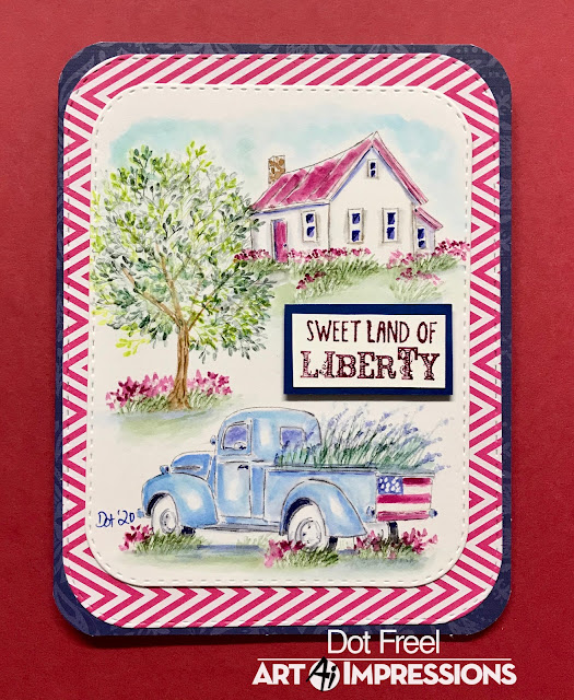
I started off by cutting a mask using a circle die and used the negative space to create the oval shape.


Next, I inked up the cottage from the Cottage Exclusive set in brown.  I pulled the color out of the lines.  To give this little cottage some color, I added some pink to my palette and painted the front and sides.  I also added some layers of brown to the room, making sure to keep the areas where the shadows would be dark. I took some blue from my palette and added it to the windows of the house. 


I masked off the top of the flower box and stamped in the flower bunch that comes in the set using purple and green.  I stamped it multiple times and added water to soften them.  I added blue and brown to my palette and added in the water and sand.  


For the fireworks, I inked the long grasses from the Wagon Set in red and stamped it into the sky.  I added a small amount of water.  I added some red to the water and the roof of the house.  Finally I added some blue to the sky.  I made sure to bring my color out to the edge of the mask so it would create the oval shape.


I added my signature to the bottom of the house!  I am so in love with this set, I hope you got the chance to pick it up in the limited release.  I go to a class every year just for the exclusive set (and to paint with Georgia). 


I hope you all join me in painting this weekend!  Tag us so we can see your amazing work!


Have a happy & safe weekend!  Happy Independence Day!


SUPPLIES : 


Dot Freel - Instagram - Blog - Pinterest

Hello,

Happy 4th of July! I am very patriotic and I love the colors of red, white and blue. So I knew I wanted to make at least one Independence Day card and I saw an acrylic painting like this scene on Pinterest, so that's what I decided to make for the bi-monthly Art Impressions Watercolor Weekend


Fun fact: My husband and I lived on a horse ranch in Kansas when we were first married and we drove a light blue '55 Chevy Truck just like this one. The floor bed of the truck was wooden slats and we would use that truck to haul hay and grain for the horses. It had a stick shift and no air conditioning which wasn't fun in the summertime. 

I made a YouTube tutorial for this card and you can see it here. I hope you like it and will give me a thumbs up and subscribe to my channel. Thank you so much to all of you who have subscribed already. Your encouragement and comments drives me to keep making tutorials.


Karen Day - Blog - Facebook - Pinterest

Happy Saturday Ai Fans!!!
 For this weekend's project, I was aiming for a bit of a 'retro' feel 
using a softer, muted palette for my scene.


I stamped my Cafe image from 5260 - WC Large Shops Set in Tombow Dual Brush marker #969 Chocolate on my Canson XL watercolor paper.  I used my damp #4 paintbrush to soften the lines, and primarily pulled the colour out and away from the image, which gave a soft brownish halo to the shop - like a 'sepia-toned vintage photo' appearance.  I almost left it that way, but this is when I decided to use a very muted, pale colour palette.  

I chose #076 Green Ochre (despite the name, it's a golden yellow shade) and painted a soft wash of it as the shop colour, and stamped it with the tiny dotted flower image from 5009 - WC Mini Flower Set to fill my flower boxes.  A stronger shade of it was used to paint in the door.


I chose #772 Blush to paint in the sign, and add the stripes to the awning.  A very watered-down version of #526 True blue was used for the window boxes and painted in as the sky.  The flowers needed to stand out a little more, so using the finer tip of my #312 Holly Green - I added the tiny little bits of foliage directly on my paper.  I painted it in as a suggestion of the grass, and some shrubbery, then used the marker to draw in a few blades of grass.  

With #992 Sand, I painted in the walkway, and added a little colour to the roof.  I picked up a very watered down version of #565 Deep Blue from my palette, and used it to paint shadows on the chimney, under the eaves, stairs and planter boxes - and also painted shadows into the windows.  I made sure to leave plenty of white space on the windows to imitate the reflections in the glass.  
  

Lastly, I stamped the Cafe sign using #969, then used Memento Rich Cocoa ink to stamp in the sentiment from 5136 - WC Sentiment Set 2.  The scene was diecut with the 5063 - Rectangle Double Stitched Dies, mounted on a soft kraft cardstock and added to the background I'd chosen of some muted/retro papers.  I am always drawn to strong, bright colours - so this was very out of my comfort zone!  I recommend trying something new whenever you can (it's a great way to get yourself out of a rut, and off in a new direction!).


Thank you, ladies, for your wonderful weekend additions to our blog!
Happy Stamping!

No comments: