Showing posts with label Watercolor Weekend. Show all posts

Saturday, September 19, 2026

Simple Beauty by Gennette Houghton


Hello, and Welcome to Watercolor Weekend.  Art Impressions released the most beautiful sets for Bible Journaling and they are great elements for cards as well.  I am so excited to work with these sets some more!

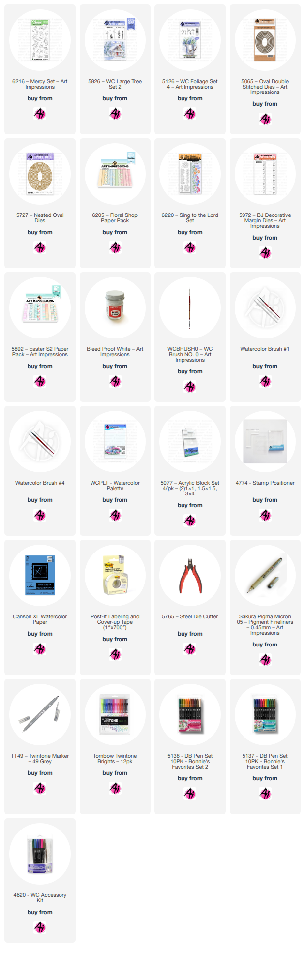
Isn’t this guy the cutest thing ever!!!!  I fell in love with him the very first time I saw him!  I used 6216 Mercy Set, I started by stamping in Distress Ink Pumice Stone after stamping off once and placed it on my watercolor paper.  I created a mask for the bird and leaf and used liquid masking fluid to cover the water drops.  I then used the 2nd from smallest 5065 Oval Double Stitched Dies to trace a guide around the image, and then will use it to cut my project out.  I took a pencil and ruler to put in a guide for the horizon line, and used a black micron on the bird’s eye.  055, 025, and N15 was used on the main part of the body.  For the beak and the little tiniest of toes I used 946.  The small section of white under the wing I shaded with 565.  I added some highlights on the head with some Bleed Proof White.  I started with 126 on the leaf and then shaded with 177, leaving the area under the water light.  I then added in some 565 and 025 in the water and added some highlights with Bleed Proof White as well.  Using the horizon line I colored the ground with 969, darkening under the leaf for a shadow.  526 was used for the sky before I put the foliage and flowers in.  After masking the image I used 5826 WC Large Tree Set 2 for the grass in 177 and two small spots at the base with 969, stamping multiple times on both sides.  I then took the leafy branch from 5126 WC Foliage Set 4 and used 126 and then drawing a line up both branches with 177.  I then stamped in the flowers from the set in 177 and 526, darkening the centers of the flowers with more 526 after pulling the color out.  Tiny dots were also added with Bleed Proof White.  I softened all of the foliage with a damp brush finishing off my image.  I decided to leave the pencil guide in for the oval and shaded around it with 535.  I then used the die to cut out my image, and used 5727 Nested Oval Dies, 8th from the largest to cut out a mat.  6205 Floral Shop Paper Pack was used to mat my card base.  I used an embossing folder on some solid cardstock for the band, and popped my image up with foam tape. 

For my 2nd card I used 6220 Sing to the Lord, such a beautiful set, and Bonnie out did herself this time!!  I started by cutting my watercolor paper down to 4 ¼ by 5 ½ since I plan on matting my card base with it.  I then used my stamping platform because I plan on extending the line of wildflowers.  I used Distress Ink Pumice Stone and stamped off once each time.  I lined up the stamp to the left edge first, and then lined the stamp back up on the right to go completely across the paper.  I used 126 and 177 for most of the stems and leaves, on a few I used 192 and 249.  For the purple sprigs I used 676, the daisies I used N60 and N52 to shade the petals.  The centers I used 055, 025, and 026, and then added a bit of Bleed Proof White on the petals to brighten them a bit.  For the 2 little flowers I used 905, and the yellow flowers I used the same combinations as I did for the centers of the daisies.  For the Coneflowers I started with 685, it was more purple than I wanted so I went over it with a little 725.  For the centers I used 947 and shaded with 969, I also added a couple of dots of BPW.  I added in some 526 in the background.  I decided to take a ruler and pencil to create an edge at the bottom of the flowers and extended any of the foliage to meet up with the line that I needed too.  I then “shaded” the line with 725 to match the paper I chose from 5892 Easter S2 Paper Pack.  I used the 5972 BJ Decorative Margin Die to create a border in a matching solid cardstock and topped it with the paper I had picked, finishing off my card.  I was going to add the included sentiment but I decided not to.  I never have been big on putting sentiments on the front of a card, it leaves my options open for what the card can be used for.  Thank you so much for joining me today, and I hope you enjoyed my cards.  Until next time!  Create….Share….Inspire!


Sunday, September 13, 2026

The Magic Starts at the Santa's Workshop - Light it up.


Here is my First Card!
The Magic Starts at Santa's Workshop


 Hello Crafty Friend,


I am excited to share two cards I created for you this week using stamps from the latest release. And one of the cards lights up. I used Canson XL watercolor paper and painted the images with Tombow markers.

Here are the step-by-step instructions for the first card, which features Santa's Workshop (stamp #6250), Poinsettias (stamp #6253), and the Christmas Blessing set (stamp #6252), along with light fixtures from Pear Blossom Press:

1.  Stamp Santa's workshop in the middle of the paper.
2.  Color the stamped image using Tombow markers.


3.  Stamp the poinsettias above Santa's workshop, and the gate and trees below it. Lightly sketch a pebble path from the workshop to the gate using a pencil.
4.  Color the elements with Tombow watercolor markers and paint the sky light blue.


5.  Carefully cut out the windows and light fixtures using an X-Acto knife.
6.  Apply Dr. Ph. Martin's Bleed Proof White to create a snow effect.


7.  Poke small holes in the Christmas trees for the lights.
8.  Cut a piece of vellum and color it with a yellow alcohol marker.
9.  Glue the vellum to the back of the painting, ensuring all cut-out areas are covered. Use a gel pen to draw the window's frames.


10. Cut a piece of cardstock to match the size of the card panel.
11. Tape the Pear Blossom Press Twinkle Lights to the cardstock, positioning one light for Santa's workshop and one for each tree, with the push button centered at the bottom, (I moved it down after I took the picture)
12. Apply foam tape around the workshop and tree areas.


13. Test the lights to ensure proper positioning, then adhere the cardstock cut on step # 10.
14. Cut a card base measuring 5.5 x 5.5 inches.
15. Cut a piece from the Christmas Journal cardstock collection slightly smaller than the card base, glue it to the base, and center the painted panel on top.


The best way to appreciate this card is through a video. Use the link below to watch a short YouTube video of this card, and while you are on that page, check out other videos that I have made using Art Impressions Stamps on my channel, Crafts and Designs by Neema. 


My second Card!!!!

For the second card, I created a Thanksgiving design using the barn from set #6249 and the Thankful and Blessed set #6254.


I hope you enjoy these projects! You can find the links to all the supplies below. Please let me know if you have any questions.

Stay crafty, and I will see you in the next project!

Neema


Saturday, September 12, 2026

Sunny Scarecrow Friend Card and Thinking of Home 3D Storybook Frame by Diane Mason

   Hello, and welcome back for Watercolor Weekend!

Hello, my Ai Watercolor friends and fans! I have two projects to share with you today. The first is a book-binding fun fold card featuring a friendly scarecrow surrounded by a field of sunflowers in full bloom. The second project highlights one of the newest additions to the Storybook Box Series – Thinking of Home.

Sunny Scarecrow Friend Card:

I just love this time of year. Everything about fall makes me happy—the cooler temperatures, the colorful autumn leaves, the festivals, the comfort food, and of course the golden sunflowers. Today’s book‑binding fun fold card was inspired by all the good things autumn brings. The friendly little scarecrow stands in a bright field of sunflowers, capturing the cheerful, cozy spirit of the season.

Colors and Supplies Used:

Paper: Canson XL Watercolor Paper

Cardstock: Green and white

Patterned Paper: 5973 – Fall Series 2 Paper Pack

Brushes: No. 4 round brush, No. 0 round brush

Stamps & Dies:

  • 6255 – FG Sunflower Border
  • 5594 – Harvest Scarecrow Set
  • 5734 – Friend Sentiment Set (You brighten my day! - sentiment)
  • 5507 – Harvest Together Set (Hay Friend! - sentiment)
  • 5061 – Square Double Stitched Dies

Ink for stamped images: Versafine Vintage Sepia

Tombow Dual Brush Pens: 026, 055, 177, 228, 555, 565, 772, 837, 912, 925, 933, 942, 946, 969, 993

Other: Post-It tape or Masking Paper, foam squares, Brown and Orange TwinTone Markers, and twine.

Stamping:

To begin, I die‑cut a 3.25" x 3.25" stitched square from Canson XL watercolor paper using the second‑largest die in 5061 – Square Double Stitched Dies. Since masking would be needed for this scene, I first stamped the sunflower border (6255) in Versafine Vintage Sepia onto the die‑cut square, then stamped it again onto masking paper to create a mask (Step 1). Refer to the step‑by‑step photo above for Steps 2–5.

Painting:

I brushed in the sky with a watery mix of 555 and painted the foliage with 177. The sunflowers were painted using 055, 993, 946, and 933, with centers in 969.

For the scarecrow:

  • Face & neck: 912
  • Cheeks: 772
  • Nose: 933
  • Hair & hands: 026
  • Hat: 228
  • Wine‑colored patches & shirt stripes: 837
  • Overalls: 942
  • Yellow‑orange patch: 993 + 933
  • Shadows under the hat brim and collar: 565
  • The robins were painted with 969, 933, and 925.

To finish the details, I added small stitching lines to the scarecrow and darkened the eyes of both the scarecrow and robins with a Brown TwinTone marker. The Orange TwinTone marker was used to add plaid lines to the yellow‑orange patch.

Card Assembly:

I matted the finished painting with green cardstock, leaving a narrow 1/16" border.

For the book‑binding card base:

  • Cut white cardstock to 4.25" x 11.5"
  • Score at 4.25" and 5.5"
  • Fold at the 5.5" score line

For the green book‑binding panel:

  • Cut green cardstock to 4.25" x 5.5"
  • Score at 1.25"
  • Adhere to the card front, aligning score marks
  • Add glue only inside the book‑binding section

Decorate the front with patterned paper:

  • Leaf paper: 1 1/8" x 4 1/8"
  • Red/brown check paper: 4 1/8" x 4 1/8" 
  • Leave a small border around each piece.

Mount the painted panel with foam squares for dimension. Wrap twine around the book‑binding three times and tie in a bow.

Interior:

Die‑cut a stitched square of white cardstock using the largest square die from 5061. Add a decorative strip of green cardstock and leaf patterned paper along the bottom edge. Stamp the sentiments from 5507 – Harvest Together Set and 5734 – Friend Sentiment Set.

This sweet fall sunflower and scarecrow card is now ready to brighten the day of a friend who loves autumn as much as you!

Thinking of Home 3D Storybook Frame:

My bonus project features the recently released 6116 – Thinking of Home Storybook Set. This set has been very popular among the Design Team lately—here’s my take!

I stamped the images onto Canson XL Mix Media paper using Versafine Onyx Black Ink. Colors used: 026, 177, 555, 565, 856, 993, 947, 969, N52, N25. The decorative paper is from 5963 – Winter Woodland Paper Pack.

For the back of the box, I used the same patterned paper and added the “hello” die cut from 5718 – Mini Journal Template. These little 3D Storybook Boxes make wonderful gifts for a friend or anyone who loves miniature scenes!

Thank you so much for joining me for Watercolor Weekend. I hope you have enjoyed today’s projects! Until next time, Happy Painting!

Sunday, September 6, 2026

Garden Scenes & Storybook Dreams by Simone Carr


Hello Fellow Crafters!

Welcome to another Watercolor Weekend! I’m excited to share this week’s card with you. I was especially excited to use the new Flower and Foliage Sets with this image. I love when one stamp can create an entire scene, and this image has so many fun little details to bring to life with watercolor.

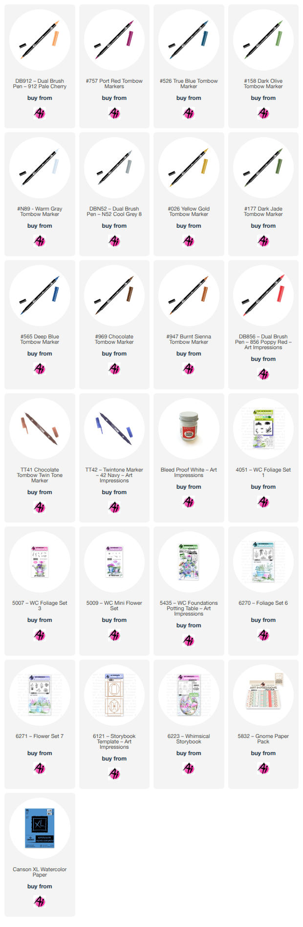
On Canson Watercolor Paper, I stamped the image using 565 + 969, stamping off twice for a softer impression. With a damp #4 brush, I pulled out the stamped color first. Before I added color to the pots, I started with the larger elements of the scene and worked my way through each of the smaller details. The Tombow colors I used for each element are listed below.

After I had my pots colored. I started to stamp in the flowers and foliage. With a damp #4 brush, I dabbed the flowers and foliage to soften the look.

Once I finished the flowers and foliage, I added the final details to complete the scene. I really enjoyed bringing all the little elements of this image to life.


Materials Used

Stamps & Dies
• 5435 – WC Foundations: Potting Bench
• 6270 – Foliage Set 6
• 6271 – Flower Set 7
• 5009 – Mini Flower Set (Dots)
• 4051 – Foliage Set 1 (Grass)

Paper
• Canson Watercolor Paper

Inks & Mediums
• Dr. Ph. Martin’s Bleed Proof White
• TwinTone Markers – Brown, Gray

Tombow Markers
• N52, 757, 158, 177, 565 – Bucket with Foliage
• 026, 177, 565 – Pot, Bottom Shelf
• 947, 158, 565 – Birdhouse
• 947, 946, 177, 026 – Pot
• 158, 026, 757 – Watering Can
• N89, 177, 817, 526 – Crate
• 991 – Hat
• N89, 565, 177, 757 – Pot Next to Hat
• 947, 946, 565, 177 – Double Pots
• 026, 757, 158, 526 – Last Pot


For an extra project this week, I decided to create a little storybook scene using the new Whimsical Storybook Set.

I stamped all of the images onto Canson Watercolor Paper using Distress Ink Lost Shadow. Once the images were stamped, I colored each piece using the Tombow markers listed below and then used the coordinating dies to cut them out.

I chose a heavier cardstock to build the main outer box as well as the three inner layers.

I used the square die that comes with the set to cut three squares. I then stacked the three squares together and used the included oval die to cut the center opening. I attached an image to each inner layer and then stacked the layers together using foam dots in the corners to create dimension.

I hope you enjoyed this week’s projects and found some inspiration for your next watercolor creation. Thanks for stopping by, and I hope to see you again next time!


Materials Used

Stamps & Dies
• 6121 – Storybook Template
• 6223 – Whimsical Storybook

Paper
• 5832 – Gnome PP
• Canson Watercolor Paper

Inks & Mediums
• Distress Ink – Lost Shadow
• Dr. Ph. Martin’s Bleed Proof White
• TwinTone Marker – Brown
• 2mm Foam Dots

Tombow Markers
• 126, 757, 565, 947 – House
• 856, 947, N49, 606, N15, 757, 177 – Wheelbarrow
• 947, 969, 177, 856, 985 – Stump
• 757, 126, 947, 969, 942, 912 – Gnome


Saturday, September 5, 2026

Visions in Pink by Gennette Houghton


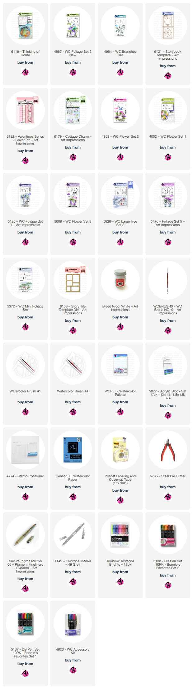
Hello and Welcome to Watercolor Weekend! The new 6116 Thinking of Home Set in the Storybook Series is such a lovely set, the possibilities for this is amazing.  

I decided to go with a mix of browns and pinks, and I absolutely love how this turned out!  I was going to get a picture of the images after I colored them before assembly, but I got sidetracked, and when I returned to it and cut the images out with the included dies and started putting it together, is when I figured out that I had not.  This set comes with 5 images, one as the back piece and then 4 layers. I decided that I actually wanted to cut out the house so that I could pop it up on foam tape, so I stamped in a guide of the house on the piece of watercolor paper so that I could put in some flowering trees beside it.  I did a wash of 772 for the sky and then used 4964 WC Branches Set in 899, adding dots of 772, 817, and Bleed Proof White for the flowers.  I stamped a second image of the house, so that after coloring I could cut it out and pop it up over the guide I stamped on the back piece.  For the roof and the trim on the door and window, I used 899, and over that in areas 879. For the walls I did a light wash of 969, and also added details to the walls and roof using 4867 Foliage Set 2, the little foliage, in 990 on the walls and 969 on the roof. Which of course I figured out after assembly that you can’t see it.  I used 969 on the chimney and shaded with 565.  For the door and window panes I used 772, the handle on the door I used 947 and shaded with 969.  For the front porch I used the same colors as the house, a light wash of 969 with 899 and 879 on the roof, shading with 565.  Using the same foliage as before, I also added some details on the front post using 990. I did mask these off with post-it tape just in case.  For the next layer with the cat in the chair, I went a little darker with the 969 on the chair and shaded with 565.  For the cat I started with 565 to shade areas since part of the cat would be white, and then added some N52 for a light gray and a touch of 772 for the inside of the ears.  The flowers were done with 817 focusing more color in the center. 126 and 177 on the leaves and 899 on the pot.  For the stone I used N49 with N57 between the stones and then added shadows and shading with 565.  Next is the bird house, for the post 969, base color on the house is 772, adding details with 817.  The roof was done with 879, the perch 969.  For the hole, 969 and 879 was used.  The last layer with the mailbox, I started with 969 on the post, N60 for the base layer on the mailbox with some N52 in areas and shaded with 565.  For the flag I used 817. The little bird, I used a black micron on the eyes, beak, and legs first. I then did a base color of 772, contouring with 817, and then added a touch of 969.  Each of the stamp sets come with their own dies to cut out the images, but you will need 6121 Storybook Template Dies to create the ornament.  The Template has all of the dies you need to cut out the components to assemble it together.  The square to cut out the back piece and layers, and an oval to cut out the openings to line up with the opening in the outer casing.  Each of the stamp images stamp out a section that lines up with the oval opening that you glue behind the paper layer that just leaves the image visible through the opening.   Once you cut out the outer casing, you glue your back piece in, personally I prefer to put the layers together before attaching them over the back piece, a little easier for me that way.  You will want to use foam tape between the layers, usually a square in each corner does the trick. I used a double layer of foam tape for added dimension between the layers. Since I popped up the cut out image of the house, I wish I had added one more layer of foam tape to the back of the porch layer.  Just make sure as you are assembling that your layers are actually going to fit, I leave the backing on the foam tape and stack it inside to make sure there is enough room, then you can adjust from there if you’d like before putting it together.  Once I have my layers together I then fold along the crease lines and then attach my layers into place and then glue the edges down.  I used 6182 Valentines Series 2 Cover paper pack for the casing and the hanger.  Once the sides were set, I then attached the hanger and added a bow and ribbon.  I hope you will enjoy this set as much as I do!

I loved the color combo so much on my first project that I decided to continue with that color theme.  This time I used the 6179 Cottage Charm with the 6158 Story Tile Template Die. I cut down my watercolor paper down to 4 ¼ by 5 ½ and then placed the die over the paper to trace out some guides with a pencil. Just don’t make the same mistake I did, I put the die with the cut side up, which meant that I had to turn my paper over and cut from the backside to get it to line up with my images.  (Still shaking my head!) So place your die, cut side down before you trace your outlines. I then decided where I wanted to stamp each image. I used Distress Ink in Pumice Stone and stamped each one off first, if you are worried about the position you can always use a stamp positioner. For the sentiment I used Versafine Clair in Nocturne, using a permanent ink allowed me to watercolor the background in without causing the sentiment to bleed.

Flower pots: I used 879, 947. 4868 Flower Set 2/flower bunch in 177, 772, 817. 4052 Flower Set 1/ daisy bunch in 772, 817.  5126 Foliage Set 4/small vine in 249. 177 for the ground and 526 for the sky.

Bird Bath: 565 and 969 mixed with a touch of 526.  Water: 565 with a touch of 526 and 817 for the reflection.  Bird: 772, 817, and a touch of 969. 5126 Foliage Set 4 for the leafy branch in 126 and a line drawn up through the image with 177.  5008 Flower Set 3 with 772 and 817 at the base of the petals and 177. 

Fence: Background 526.  5826 Large Tree Set 2/grass: 177 with a touch of 969 in 2 small spots at the base.  5476 Foliage Set 5/grass, just inking the tips in 817. Fence: 565 for shading and a couple of touches of 947 in light wash for interest. 

House: Roof, window and door trim. 899 and 879. Walls, light wash of 969.  Chimney and steps, 565 and 969 mixed, 565 for shading.  Door and window panes 772. Door knob 969. Shutters, 772 and 817 for the slats.  Ground 177 and 526 for the sky. 5372 Mini Foliage Set/bush line in 249, Bleed Proof White for the flowers.  4964 Branches in 899, dots of 772, 817, and Bleed Proof White for the flowers.

Sentiment: 772 for the background.   

Bike: 772, 817, 969, N15, 565 for shading, pencil for spokes.  5126 Foliage 4/leafy branch in 126 with 177 right up the center.  947 for the ground, and 526 for the sky.

Always remember that sets like these can be used in so many ways. You can use each stamp individually, or create your own scenes.  I for one am looking forward to playing with the possibilities.  Thank you so much for joining me today, until next time! Create….Share….Inspire!


Sunday, August 23, 2026

From a Classic Door to a Blooming Garden


From a Classic Door to a Blooming Garden


Welcome to Watercolor Weekend; today is August 23, 2026
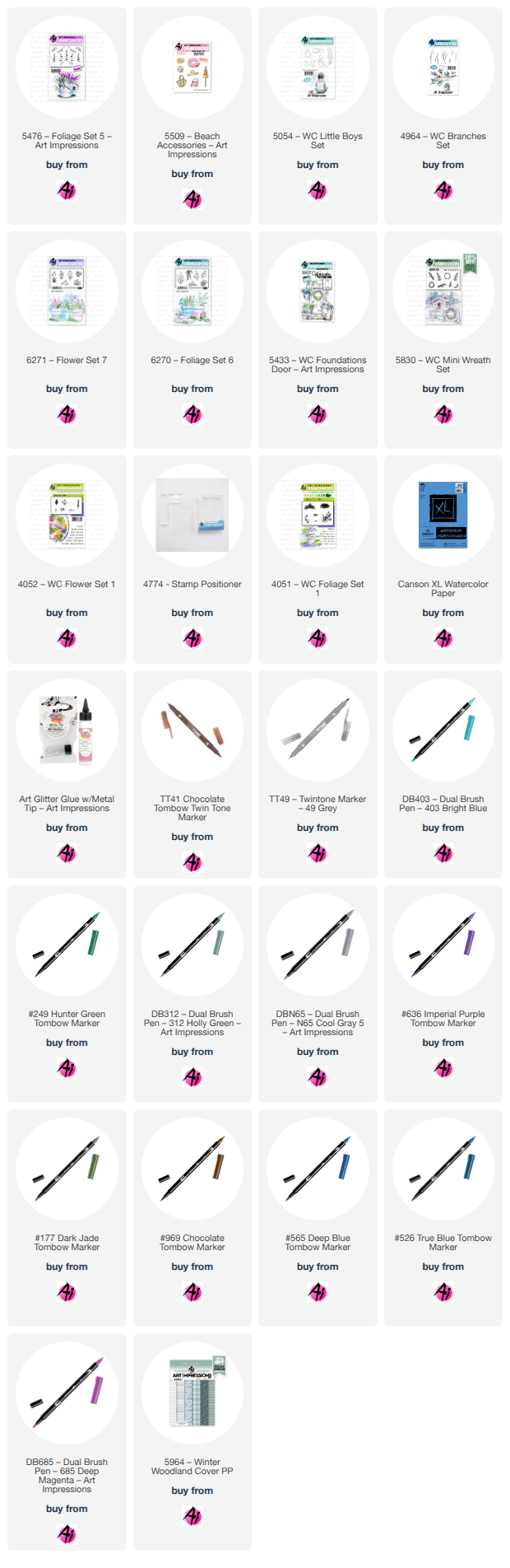
There’s something truly special about giving a classic stamp a new look. For this A2-size card, I combined the classic door stamp #5433 (WC Foundation Door) from 2021 with the recently released flower stamps #6270 and #6271 (Foliage Set 6 and  Flower Set 7) to recreate a charming scene filled with color and texture.


Painting the Door and Creating the Brick Wall

I began by stamping the door using Tombow markers #969 and #565. To color the door, I chose light shades of gray, purple, and blue to give it the appearance of weathered white wood. I then colored the flower pots and steps using very light shades of pink, purple, green, and blue.                   


To create the background wall, I used a brick stencil paired with a dry-brush watercolor technique for a soft, artistic look. By applying a small amount of watercolor to a relatively dry brush and lightly sweeping it across the stencil, I achieved a beautiful, uneven texture that gives the wall an aged character.


Adding the Flowers
Using Foliage Set 6 and Flower Set 7, I inked the stamps with markers and stamped the flowers directly into the pots. I also added foliage over the door and a wreath using stamp set 5830. Because the ink dilutes slightly with water, each flower features a unique blend of color, making it look as though a vibrant garden is growing right outside. To finish, I used PH Martin Bleed Proof White to add small white flowers. I painted the door hardware in gold and added a touch of grass to the bottom step using foliage set 1 (#4051).


Putting the Card Together

Once completely dry, I trimmed the main panel to 4" x 5.25" and layered it over a 4.25" x 5.5" coordinated background from the Winter Woodland paper pack (#5964). Finally, I mounted the entire piece onto an A2 card base.

The watercolor effect from the Tombow markers brings everything together beautifully, creating a soft, hand-painted finish that looks completely custom.

A Quick Tip
When using Tombow markers with stamps, experiment with your water ratio. Less water preserves defined details, while more water creates softer, blended colors. Don't be afraid to let the colors mix and move naturally—those minor variations are what make each image look like a miniature watercolor painting.
 

Second Project: I will SEA you Soon


For my second card, I used stamps 5054 and 5509 along with Tombow markers to craft another watercolor-style scene. This image features a boy pausing during a playful day at the beach to watch a sailboat in the distance (featuring the exclusive sailboat stamp, WC0526).

I hope these projects inspire you to break out your classic favorite stamps and combine them with something new. Sometimes, the most unexpected combinations create the most beautiful cards!

Happy Crafting!

Neema 


Saturday, August 22, 2026

Last Days of Summer Card and Interactive Whimsical Storybook Box by Diane Mason

  Hello, and welcome back for Watercolor Weekend!


Hello, my Ai Watercolor friends and fans! I have two projects to share with you today. The first is a card featuring a darling, sleepy little girl resting in her favorite rocking chair, soaking up the sunshine and enjoying the last days of summer. The second project highlights one of the newest additions to the Storybook Box Series.

Last Days of Summer Card: 

This square card was inspired by all the kids heading back to school. I was always a little sad when Summer Break came to an end — it always seemed to fly by too quickly. This sweet little girl is nestled in her rocking chair in the garden, soaking up the sunshine and savoring those final, carefree days of summer.


Colors and Supplies Used

Paper: Canson XL Watercolor Paper

Cardstock: Purple

Patterned Paper: 5939 – Fairy Garden Paper Pack

Brushes: No. 4 round brush, No. 0 round brush

Stamps & Dies:

  • 5360 – WC Rocking Chair Set
  • 5578 – Little Angels Set
  • 5475 – Flower Set 6
  • 6271 – Flower Set 7
  • 4051 – WC Foliage Set 1
  • 6270 – Foliage Set 6
  • 6047 – Scalloped Square Dies

Ink for stamped images: Versafine Smokey Gray & N52

Tombow Dual Brush Pens: 177, 249, 555, 565, 603, 606, 910, 912, 977, 969, 772

Other: Post-It tape, Masking Paper, Dr. Ph. Martin’s Bleed Proof White, Brown TwinTone Markers

Since I knew I’d need to do some masking for this scene, I first stamped the rocking chair (5360 – WC Rocking Chair Set) and the girl (5578 – Little Angels Set) on scrap paper. This helped me see exactly where to place the masks so the girl would look naturally seated in the chair. I also left off her wings for this design. The rocking chair was inked with Versafine Smokey Gray, and the girl was selectively inked with N52. Once I had the placement figured out, I stamped the images on to Canson XL watercolor paper.

Painting:

I brushed in the sky with a watery mix of 555. For the foliage, I stamped with 177 and 249, and the flowers were stamped in 555 and 606. I used 603 for the girl’s dress and 277 for her hair and shoes. Her skin was painted with 910 and 912, with 172 added to her cheeks. The rocking chair was shaded with 565.

White highlights were added with Dr. Ph. Martin’s Bleed Proof White, and I finished the scene by adding small details where needed with a brown TwinTone marker.

I matted the painting using the largest square scalloped die (6047 – Scalloped Square Dies), cut from purple cardstock, and layered it onto a 4¼ x 4¼‑inch piece of patterned paper from the 5939 – Fairy Garden Paper Pack. The panel was then adhered to a square white card base of the same size.

Interactive Whimsical Storybook Box:

My next project features the newly released 6223 – Whimsical Storybook Set. This set includes both a fairy and a gnome that can perch on the wooden stump, and I couldn’t choose between them — so I used both and made the box interactive! I attached tiny magnets to the backs of the fairy and the gnome, as well as to the inside front and back of the box, so you can swap them out whenever you like. It’s such a fun little detail that brings the whole Storybook scene to life.

Here are all the images painted and die cut. Colors used: 679, 177, 249, 885, 847, N25, N52, 565, 555, 905, 845, 992, 977, 925,192,133, 526, 912, and 942. I used branches from 4964 – WC Branches Set for the trees and leaves from 5372 – WC Mini Foliage Set. The grass is from 4051 – WC Foliage Set 1. The images were stamped with Versafine Vintage Sepia Ink. Red, blue and brown TwinTone markers were used to add detail.

Adding the magnets:


Interactive Options (front):

Interactive Options (back):

The gnome and fairy can be attached magnetically to the back too!

The sentiment is from 5935 – Fairytale Houses Set. Patterned paper is from 5832 – Gnome Paper Pack.

I think anyone would be super excited to receive this adorable interactive Storybook Box as a gift! Reminder: Safety First - this should not be given to a small child – tiny magnets are a chocking hazard and should not be ingested!

Thank you so much for joining me for Watercolor Weekend. I hope you have enjoyed today’s projects! Until next time, Happy Painting!