Welcome back Ai Fans, I am excited to announce this is the last installment of my Freebies Journal Series pages 12 through 15! It was a hoot to create, and I can’t wait to share. Be sure to scroll down all the way to the end to see a video of the completed Journal!
Let’s review pages 12 and 13. It’s mostly Copic techniques and some
masking. I wanted a home for the critters
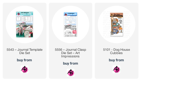
and was excited that the house set from the Dog House Cubbies was perfect! A
great addition to the scene. I
incorporated a new Copic technique (for me) which includes lots of texture on
the ground using only markers and not stamps.
In addition, I wanted to create a picture like scene that could be found
in a kid’s book. Overall, I was very
pleased with it, it did take a hot minute since it’s all about layering and
layering again.
Basically, I started by stamping and masking the entire scene.
As I started coloring, I wanted the balloon to appear “clear”. As shown below, I added light lines from the background onto the balloon surface creating a see-through effect.
This layout was a bit more challenging for a couple of
reasons…I wanted to include a heavily masked area without making the scene look
cluttered or confusing. Secondly, the hedgehog
flying within the scene needed to make sense visually, and finally, I wanted to
create a slope or hill like setting for the ground.
I addressed the first challenge by creating a clean mask when stamping, followed by choosing the right colors and tonality.
I added spots to the dog so it would be more prominent than the frog. I used one color (green) in different shades for the
frog and painted the goose in a bright yellow.
It’s also important to “ground” each critter in their own space or plane. For the second challenge, I simply added a hedge (no pun intended, lol) in the background so the hedgehog looks to be up in the air. Finally to create a slope, simply angle your
color strokes. Also color in details at
an angle to suggest an incline.
I can’t say it enough; how fun this project is, I highly
recommended. It’s so relaxing and
fun. There are so many different
themes and topics, the sky's the limit!
Hope you check out the video!
And here’s a photo journal of all the pages.


No comments:
Post a Comment