
Lighthouse Hello!

I am honored to be a substitute guest designer. You know when you were in school and had a substitute teacher, some were good, some not so good. Hopefully I tempt your creativity and give you a reason to try something new. I created a lighthouse scene for a Father’s Day card.

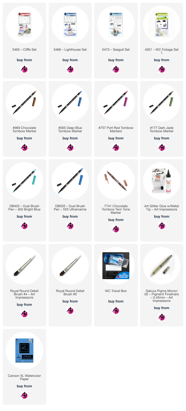
I used the following sets: 5465-Cliffs,
5466-Lighthouse, 5473- Seagull and a small grass from the foliage set, 4051.
I used Canson watercolor paper, #4 and #0 brushes, Tombow colors 969, 565, 757, 990, N35,
177, 403 and 555, TwinTone colors chocolate, gray, Prussian blue, light blue, navy and
turquoise blue, KingArt 132 - Blue, and a Zig Millennium Pure Black M5-005 micron-like pen for
fine details.
I inked the left facing cliff with 969 first, then 565. I did not stamp off as I wanted a bolder
appearance. For the right facing cliff, I only inked the part I needed to make the cliff look
complete using a stamp positioner. I then inked the lighthouse the same way and placed on
the cliff. I wet my brush and started pulling the color out of the lines to begin the shading
process. Using 757, I started adding color to the lighthouse very lightly, working from the
outside toward the middle. I continued to add layers of the same color to get the effect I was
looking for. I pulled the color out of the bottom only of the rocks and used a #0 brush to add
969 to the bottom and dragged upward to make the rocks look three dimensional and rounded.
I used 757 to paint the bricks leaving some white space. I used 990 for the door and to fill in
between the rocks. I used 990 on the small building and N35 lightly for the roof. I used the
chocolate TwinTone to draw vertical lines on the door and used the gray TwinTone to draw roof
lines. I used the Zig micron pen to draw in the windows and added minor shading for the bricks. I used 177 for the grassy areas. I added small grass from 4051. The cliffs used almost
all colors except 757. I made sure the darkest parts of the cliffs were the parts where the rocks
appeared to be stacked. I tried to leave some light parts with no color to create the highlights
of the cliff side. For the water, I used a very light layer of 565 as the base of the water. I then
added different TwinTone blues to different areas at the base of the rocks. I used just a wet
brush and dragged the color out to create the depth of the water. I continued this process until
I achieved the water I was looking for. I used 969 very lightly to create the reflection and the
appearance of rocks in the water. I added the seagulls using 565, stamping off to make one
set lighter than the other. I used KingArt 132 Blue for the rolling sky surrounding the
lighthouse. I used 555 as the super light base for the rest of the sky. I went back through with
TwinTones to make the shadows darker where needed. I used a Renke die cut for the best fit
for the lighthouse, and color coordinated backgrounds for the card.
Thank you kindly for tuning in and get happy creating!
2 comments:
Awesome! Great work!
This is gorgeous Dawn!
Post a Comment