Showing posts with label 5466 - WC Lighthouse. Show all posts

Wednesday, July 1, 2026

Watercolor Lighthouse by Dawn Wagner

 Lighthouse Hello! 


I am honored to be a substitute guest designer. You know when you were in school and had a substitute teacher, some were good, some not so good. Hopefully I tempt your creativity and give you a reason to try something new. I created a lighthouse scene for a Father’s Day card.


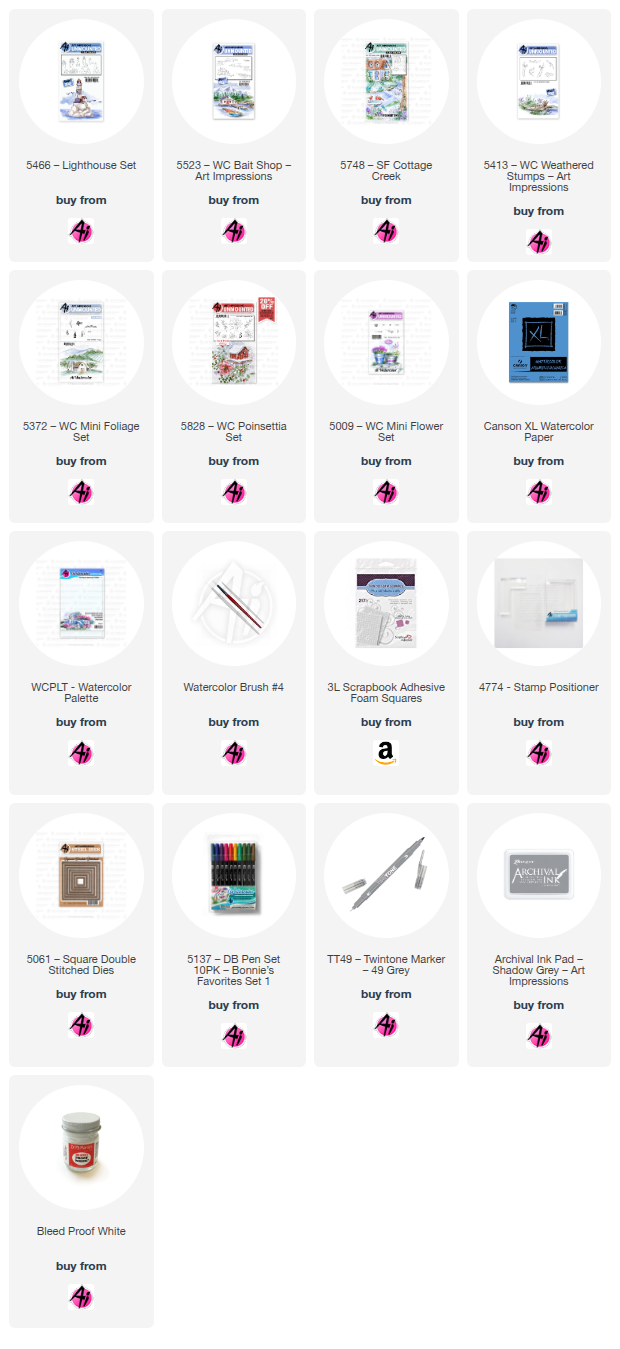
I used the following sets: 5465-Cliffs, 5466-Lighthouse, 5473- Seagull and a small grass from the foliage set, 4051. I used Canson watercolor paper, #4 and #0 brushes, Tombow colors 969, 565, 757, 990, N35, 177, 403 and 555, TwinTone colors chocolate, gray, Prussian blue, light blue, navy and turquoise blue, KingArt 132 - Blue, and a Zig Millennium Pure Black M5-005 micron-like pen for fine details. I inked the left facing cliff with 969 first, then 565. I did not stamp off as I wanted a bolder appearance. For the right facing cliff, I only inked the part I needed to make the cliff look complete using a stamp positioner. I then inked the lighthouse the same way and placed on the cliff. I wet my brush and started pulling the color out of the lines to begin the shading process. Using 757, I started adding color to the lighthouse very lightly, working from the outside toward the middle. I continued to add layers of the same color to get the effect I was looking for. I pulled the color out of the bottom only of the rocks and used a #0 brush to add 969 to the bottom and dragged upward to make the rocks look three dimensional and rounded. I used 757 to paint the bricks leaving some white space. I used 990 for the door and to fill in between the rocks. I used 990 on the small building and N35 lightly for the roof. I used the chocolate TwinTone to draw vertical lines on the door and used the gray TwinTone to draw roof lines. I used the Zig micron pen to draw in the windows and added minor shading for the bricks. I used 177 for the grassy areas. I added small grass from 4051. The cliffs used almost all colors except 757. I made sure the darkest parts of the cliffs were the parts where the rocks appeared to be stacked. I tried to leave some light parts with no color to create the highlights of the cliff side. For the water, I used a very light layer of 565 as the base of the water. I then added different TwinTone blues to different areas at the base of the rocks. I used just a wet brush and dragged the color out to create the depth of the water. I continued this process until I achieved the water I was looking for. I used 969 very lightly to create the reflection and the appearance of rocks in the water. I added the seagulls using 565, stamping off to make one set lighter than the other. I used KingArt 132 Blue for the rolling sky surrounding the lighthouse. I used 555 as the super light base for the rest of the sky. I went back through with TwinTones to make the shadows darker where needed. I used a Renke die cut for the best fit for the lighthouse, and color coordinated backgrounds for the card.

Thank you kindly for tuning in and get happy creating!
Sunday, June 1, 2025

Lighthouse and SF Cottage Creek - by Karen Day

 Hello Ai Watercolour fans!


Every once in a while I love to just create a lighthouse card!  So I pulled out the 5466 - WC Lighthouse Set, and created a bit of a 'rainbow' lighthouse.

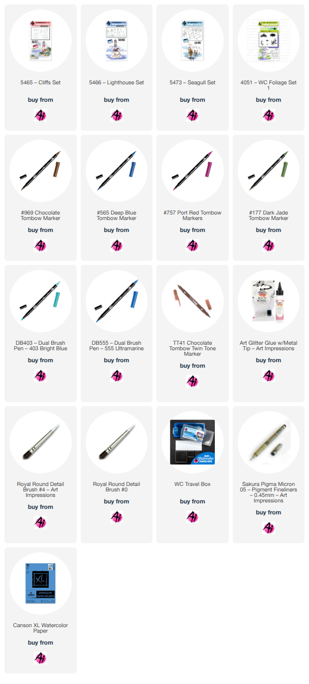
I stamped my lighthouse and one of the shorelines from the 5523 - WC Bait Shop set in the new Shadow Grey Archival ink from Ranger, since I knew I was going with 'pretty' colours, and didn't want any muddy outlines.  I stamped the two trees from 5372 - WC Mini Foliage in #969 on either side of the lighthouse, and using the foliage stamp from the set, I stamped in #177/126 to create the leaves.  To create my rainbow lighthouse, I started by painting the roof in #847, then used #685 on the railing, and as a wash on the main structure.  I moved into #606 and finally #407.  Into the stones at the base, I painted touches of #407 and then #126 near the bottom - so the colours fade from top to bottom in rainbow order.  A wash of #126 was added to the grass, and darkened in the crevices with #177.  I used the shrubbery row from the 5372 set to add bushes to either side of the lighthouse, then painted out those and the trees with a damp brush.  The roof of the small building was done with #847, and the base of it in #555.  Layers of #992/947 were painted on the edge of the bank, concentrating the colour in the crevices, and tones of #N55 were used on the rocks.

I loaded up my brush with #407 and painted a line to indicate the horizon, then washed out the colour in a streaky fashion along the shoreline.  I darkened the water nearer to the shore, using #555.  I wanted to create a bit of a fantasy sky, so painted some #407 in a way that suggested clouds (the white space left below), then added #991 to the sky, and a very pale version of #685.  Both of these colours were painted as reflections in the water as well.  I like to add some darker areas to clouds for just a touch of drama, so used a wash of #606 just above the horizon.  I used my grey Twintone marker to add in any details that were painted out, or simply areas that needed emphasis.  


My scene was cut out with the 5061 Square Double Stitched Dies, matted it on a pinkish/red square of cardstock, and attached a little off-center onto my patterned paper.  The finished card is 5 1/2" square.


Card #2 is featuring the 5748 - SF Cottage Creek Scenic Foundation from Summer 2023.  I had stamped this ages ago, and finally got it painted and made into a card.

I wanted to stick mainly with primary colours, so painted the house in #991, with the door and chimney in #847, and the roof in shades of #969 warmed with a touch of #947.  The same browns were used on the tree, and the stump from 5413 - WC Weathered Stumps that I added to the foreground using my stamp positioner.  #177/126 were painted as a wash on all the hillsides and grass, as well as with the foliage stamp from 5372 - WC Mini Foliage for the leaves, and the tiny grass stamp. The two pine trees from the set were used for the treeline in the background and the shrubs on either side of the door - in #177.  Using the gray Twintone marker, I drew in the stones on the walkway, and painted around them with #991.  The stones and rocks in the water were painted with touches of N55, 565 and 991.

Painting my way forward, I added #526 as the lighter blue in the water, keeping my strokes horizontal, and then I darkened the edges with #565.  565 and 847 were used to paint the birds, and N55 added some colour and shadows to the birdbath.  Masking the stump, I added the stem from 5009 - WC Mini Flower Set in 177/565 and the sprig from 5828 - WC Poinsettia Set in #407.  With the tiny sprig from 5009 set, I added green foliage to the base of the flowers, and around the house - and topped them with tiny white flowers painted with the Bleed Proof White paint.