Showing posts with label 5981-My Joy Set. Show all posts

Sunday, August 10, 2025

Circles and Mischief by Gennette Houghton


Welcome to Watercolor Weekend! I am so glad you are here!!  5981 My Joy Set is perfect for this time of year, nothing like a beautiful bloom to brighten the day!  I really love how my first card came out, it almost has a vintage touch to it.  The inspiration for this card came from an image I found on Pintrest, created by Kerry Parkinson, click her name to head over to Kerry's Papercraft blog to see her card.


I took some watercolor paper, and the 4 smallest circles from 5064 Circle Double Stitched Dies. Tracing the inside, I did 2 of each, except for the smallest one, and made sure I left enough room to die cut them out.  I used N49 on all of the stamps, except for the grasses, and stamped off once. I used two of the flowers and the butterflies from the My Joy Set, the butterflies I inked only half for each circle.  I also took the bee from 5925 Honey Bee Set. I have a small handful of the Marvy markers and I decided to use the 108 Black Cherry on the flowers, it is a lovely deep purple. I started off with a light wash on the petals, and then darkened where the petals overlap and towards the center. For the centers of the flowers I used 025, 026, and 947. I go over the entire center with the 025, then use the 026 and paint a “C” towards the edge and then use the 947 to darken the very edge of the centers. For the leaves and stems I used 177, darkening under the blooms and the bottom sides of the leaves. For the backgrounds of all of the circles I used 098, and added in a touch of N57.  The butterflies, antennae and bodies, and the bee’s antennae, I used a black micron.  The butterflies were painted with 025 and 026 for the shaded areas. On the bee I started out with the yellows, 055 first, and then 026 to shade the sides. I then used N15 for the black areas. The wings were shaded with 565 before I added the N15 on the body. After painting the background I then put in the foliage with 177 by hand, you could also mask off the bee and use a stamp if you wish.  For the last two circles I started with the backgrounds first. The largest out of the two I used 5476 Foliage Set 5 with 177 and the Marvy 108, stamping it multiple times and added a touch of water to the flowers. The smallest circle, I used just part of the stamp in 177 from 4867 Foliage Set 2. 

Before die cutting my circles I splattered some of the 108, Bleed Proof White, and some gold paint. After it was totally dried, I then die cut all of the circles. I matted my card base with another piece of watercolor paper that I used a script background stamp, and added in some washes of 098 and 108 to help it tie in.  Starting with the 2nd to smallest and a double layer of foam tape, I placed these first. The 2 largest circles I used a single layer of foam tape and placed them next. The circles with the butterflies were glued to the page directly, and the smallest circle also has a double layer of foam tape.  I think this has to be one of my favorite cards I have made.


For my 2nd card I created a cute scene, and I think most cat owners will agree with me on their crazy antics. I started off by stamping the larger cat that is from 4873 WC Cats Set in 565/969 and stamping off twice, on watercolor paper.  I then masked the cat off and then stamped in the small cat from the 5991 Dwelling Animal Set 1 in N49 stamping off once and used the stamp positioner to place it where I wanted it. After also masking off the small cat, I used the stamp positioner again to place in the large jar from 5921 Glass Container Set in 565/969 after stamping off twice.  Leaving the two cats masked, I then stamped in the tall skinny jar from the same set in 565/969 after stamping off twice.  I then masked that jar to place the flower from 5827 Hydrangea Set in 772 for the flower and 177 for the stem. 

Removing the masks I then started pulling the color out from each image. I used a black micron on both cats for the eyes, nose and mouth. I colored the large cat with N65, N75, and a touch of N55. The smaller cat I used N79, N57, N49, and 772 for the ear.  On the thinner jar I used 990 and 992, with 565 for the water drop, and some dots with 992 on the jar for some texture.  Making sure to add the color going into the larger container lightly so that it is seen behind the larger container.  For the Hydrangea I added more 177 to the stem, and a combination of 772, 565, and 676 on the flower.  I then used a pencil and ruler to add in the wall boards and a kneaded eraser to lighten the lines but not remove them behind the jar.   I then took some 565 to give dimension to the boards, keeping it light behind the jar.  On the large container I gave the appearance of glass by using 565 and adding some 969 in the bottom to match the counter that was also done in 969, along with a touch of 565 under the water drop.  I then cut my image out with a die from 5768 Decorative Journal Page 1 Set, which I think framed this nicely, and put my card together. 

Thank you for joining me today, and I hope you enjoyed my cards!  Until next time, Create….Share….Inspire!


Sunday, July 13, 2025

Glass Flowers and Birds and Bicycle Shop by Gennette Houghton


Hello, and Welcome to Watercolor Weekend!! I love playing with random ideas, it’s even better when they turn out the way you want them too! Ever since I started with the watercolor line, I have found myself seeing inspiration everywhere. The versatility of these stamps leave endless possibilities. The idea for my first card actually came from an embossing folder, I just added birds into the mix.  

I started out using the acrylic piece from the stamp positioner set, and traced around it to give me a guide on watercolor paper.  I then masked the sides off with post-it tape.  Stamping in 3 of the birds from 
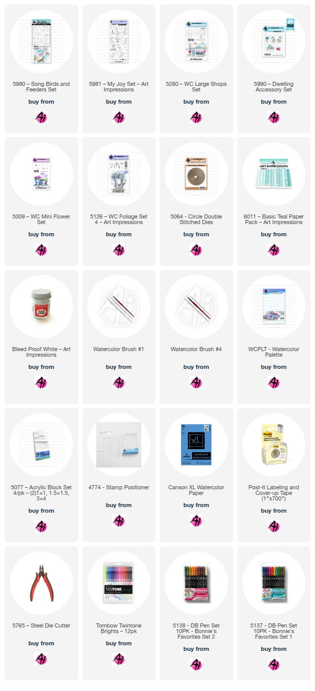
Kim’s set 5980 KH Song Birds and Feeders in N49 and stamping off once.  I then created masks for each of the birds. Taking two of the flowers from 5981 My Joy Set, using both the left and right, and stamped them in N49 after stamping off once. Turning my paper in different directions as I was stamping them in. 

I wasn’t fully decided yet on where I was going with this, so I started with 569 for the background. I knew I wanted the design to be lighter, so I focused more color around the images to help them pop. Sometimes making decisions about what color to use can be hard. I used my stamp off piece to figure out the colors I wanted to go with, trying several different variations before I settled on a combo that almost made the images look like glass. Before painting the images, I used a pencil on the eyes and legs of the birds. Starting out with N52, which is a beautiful blueish grey, giving some depth to the center areas of the flowers, and using it to define the leaves and birds. I also used this color for any areas that would be shadowed. I then went back over it again with the N52, but focused the color around the centers of the flowers and darkening up any shadowed areas. I then used 526 to add a touch of color over the images, trying to keep it a bit subtle. I then matted my card with an embossed design, cut down my image leaving a bit of a white border and matted the image with a dark blue paper. Popping the image up with foam tape and offset the image on the card base. 

For my 2nd card, I created a bike shop using 5260 WC Large Shop Set. On watercolor paper, I first stamped the bicycle from 5990 Dwelling Accessory Set and created a mask, the size of this bicycle was absolutely perfect!! I used the stamp positioner to help me place the shop exactly where I wanted it. I wanted to try out the new ink pad that is now available, Archival Ink in Shadow Grey, so that is what I used for both images.  I did, however, use a mix of 565/969 to add a bit of dimension to the building, just like you would if you were pulling the color out.

I then took a pencil and ruler to sketch in some details that I wanted on the roof, windows, and the sign.  Creating the roof tiles, I offset them and rounded the bottoms, using the pencil lines as a guide.  Using the largest circle from the Double Stitched dies, I also traced a guideline around my image.

373 is what I used on the roof, door, and trim, I also used that color on the canopies, after I had sketched in some lines on them later.  For the walls on the building I started with 090, I was going for a soft cream color, but next to the teal it almost had a green tint to it, so I lightly went over it with 990 to tone it down.  I played a little bit with the window panes, I wanted a look of an idea that there was a bunch of stuff in the shop. So in different sized blocks I used 565, 912, 055, 133, and 676.  I used 565 to shadow the door, canopies, roof peak, and also the window boxes.  I used 947 on the chimney, sign, and door knob, with a touch of 969 for the shadows. A little bit of 947 was also used on the tiles to create spaces with a little more dimension.  I also used 565 behind the sign for a shadow and at the base of it. For the bike I used 969 on the seat and handles, darkening the underside of both with the same color.  The frame of the bike was painted with 912, adding more in the shadowed areas. The pedal I used N15, and the tires a mix of 565/969.  I then masked off the bike again and each of the window boxes. The flower bunch from 5009, inked with 177 and 676, for the flower boxes.  As you can see, none of the green made it into the scene, but my masks are a lovely green! LOL! I then used the small vines from 5126 WC Foliage Set 4, inking just the tip in 177.  Stamping in multiples to create a bush under the boxes on each side, and creating a vine going up on the left side.  It was at this point I wished I had thought to add a light from 5263 WC Lamp Post Set, but I already had too much color in to do so.  Just throwing that idea out in case you wish to try.   Softening both the flowers and vines with a touch of water.  After they were dry I added in little dots of Dr. Ph. Martin’s Bleed Proof White.  I still felt the building needed something, so I decided to add bricks with 947, to give it some texture.  Some more of 565 was used to add a bit more shadows in the door well and behind the bike tires.  I used 526 for the sky, and a mix of 565/969 for the ground.  I then used 5064 Circle Double Stitch Dies, using the largest to cut out my image, and matted it onto a dark teal die cut from my stash.  I then matted my card base with paper from 6011 Basic Teal Paper Pack.  I really love how this came out.  Thank you for joining me today, and I hope you enjoyed my cards! Until next time!  Create….Share….Inspire!!


Monday, July 7, 2025

Rusty bucket of daisies by Sharon Caudle

 Hello AI Fans!!

I hope you've had a wonderful weekend and a safe and happy 4th of July if you celebrate! So, who doesn't love old rusty buckets, daisies, and gnomes?! LOL! I created a cute summer scene for you today using several different sets from Art Impressions. I started out using the bucket from 5597 Harvest Wheelbarrow Set. When I stamped it onto my Copic friendly paper, I also stamped another one onto masking paper. After applying the mask, I stamped one set of the daisies from 5918 Floral Long Stem Bouquet Set and also created a mask for that stamp.  That allowed me to stamp another set of them on the other side of the bucket to fill it up. Have you seen the new Winsor & Newton Gold Paint that Art Impressions is carrying now? Gorgeous and so easy to use! I grabbed it and a butterfly from 5981 My Joy Set. I messed one of them up (sad face), but I still love the way they look! I also added the paint to the centers of the flowers, the leaves, and the belt and button on one of the gnomes! I love the glimmer it added to the card! 


So that's it for me today! Thanks so much for stopping by for a visit and until next time - stay crafty!!


Sunday, February 16, 2025

Bird Friends by DIane Mason

  Hello, and welcome back for Watercolor Weekend!

Hello, AI Watercolor Friends! Today, I'm sharing two cards that celebrate birds and friendship. For my first card, I used songbird images from the newly released 5980 – KH Songbirds and Feeders Set by the talented Kim Hein. My second card showcases hummingbirds from another newly released set, 5981 – My Joy Set, part of the Bible Journaling Series.

Let’s get started!

For this card, I wanted to find a yellow and grayish-brown songbird for reference. After a quick Google image search, I came across a bird that resembled the one depicted here—the Western Yellow Robin. 

Growing up in the Midwest, I often saw the American Robin with its orange belly and gray-brown wings and tail. So when I discovered the Western Yellow Robin, I got excited, thinking I might spot this bird here in California on the West Coast. However, after further research, I realized that wouldn’t be the case—unless I moved to Australia! Still, this bird was the perfect inspiration for my painting.

I inked the birdbath and bird stamp from set 5980 with N79 and stamped it onto my Canson XL watercolor paper. Wanting to give the birdbath a weathered patina look, I applied a light wash of 403 to the stand and bowl, adding depth with shadows and contours.

To add to the patina, using a #1 brush, I dabbed in small brown splotches with 947, carefully preserving the highlighted areas. To enhance the shadows, I deepened certain areas with 565.

For the bird, I started by brushing in the sides, wings, head, beak, and tail with N79, then darkened the shadowed areas with a touch of N57. For the belly and throat, I began with a light wash of 062, deepening the edges with 025. To blend the yellow into the gray, I mixed a touch of N79 with 025.

For the water in the birdbath, I painted a watery mix of 403, leaving a few highlights to create the effect of water glints. To add depth to the shadowed areas, I incorporated a touch of 565.

For the floral vines, I inked the branch stamp with 177 and stamped it a couple of times. Since the stamp is clear, I didn’t need to use a positioner. I then added leaves using the leaf stamp from the set, also inked in 177, leaving some blank areas for the flowers. With a damp brush, I lightly dabbed the leaves to soften the edges.

Once the vines were complete, I added flowers using the tiny dots stamp from 5009 – WC Mini Flower Set, inked in 676. After stamping, I gently dabbed them with a damp brush to create a watercolor effect. Once the flowers were painted, I filled in a few more leaves where needed.

For the ground, I applied a light wash of green at the base to represent grass, then deepened the shadows around the base with a mix of 177 and 565. For the sky, I brushed in a watery mix of 403, intentionally pulling some color from the flowers and leaves in certain areas to create a soft, blended effect. 

When I was satisfied with the painting, I used a brown TwinTone pen to define the bird’s beak, eyes, tail, and feet, as well as to add details to the birdbath. I matted and popped up the painting on the cover with foam tape. The yellow patterned paper is from the new 6012 – Basic Yellow Paper Pack.

If you've followed my paintings here on the blog, you know I love adding a little something to the interiors of my cards. The process for painting these birds and floral vines was the same as on the cover. The "birds of a feather best friends forever" sentiment, also from set 5980, was the perfect finishing touch. I was very pleased with how the interior turned out—it could easily make a beautiful card front on another design too!

Continuing with the bird and friendship theme, I used stamps from 5981 – My Joy Set, for my second card.

Using a stamp platform I inked the vines and leaves with 177, the flower petals with 676, and the flower centers with 025. The hummingbirds were inked with N52.

With a damp brush, I pulled color from the lines of the vines and leaves, the flower centers, and the petals. Additional color was added from my palette to each of those areas to add shadows and contours. I added a little 133 to highlight the leaves. I shaded the flower centers with a little 991.

For the hummingbirds, I used N79 for the underbelly and wing edges. I then added more N79 to add shadows on the underbelly and details on the wing. For the green areas of the bird, I started with 133, then added a touch of 173, and finally 177 to deepen the shadows and details. The throat area was painted with a watery mix of 676, and then I added a touch of 725 to brighten the area. The bird's feet were painted with N79.

I inked the “life is better with friends” sentiment from set 5980 in Versafine Onyx Black Ink. The 2025 stamp is from 5981 and was inked in N52. A violet and gray TwinTone marker was used to add back details where to needed.

The blue patterned paper is from the new 6011 – Basic Teal Paper Pack. I die-cut a frame to place over the painting and popped it up with foam tape.

For that extra touch on the card interior, I inked the floral stamp the same as I did on the front of the card.

I hope these bird friend cards have inspired you and brought a little reminder that spring is on its way!

Thank you again for stopping by for Watercolor Weekend. Until next time—happy painting!