Celebration
Hi!
I return for another round of painting fun!
America has its 250th Anniversary this 4th of July. I
decided to create a celebration scene with the June Throwback.
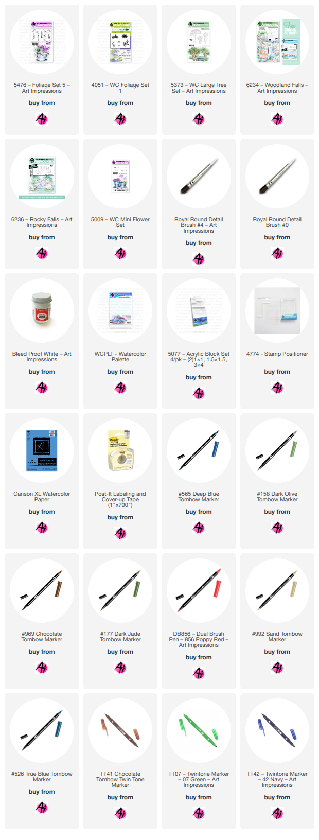
I used the following sets: 6234-Woodland Falls Throwback, 6236-Rocky Falls, 6225-
Adirondack Chairs, 5009-Mini Flowers, 5373-Lg Tree Set(leaves only), 4051-Foliage and 5476-
Foliage 5.
I used Canson watercolor paper, #4 and #0 brushes, Tombow colors 969, 565, 177, 158, 133,
856, 990, 992, 526 and N35. TwinTone colors chocolate, Prussian blue, emerald green, blue
and navy. I also used KingArt 132-Blue, and Dr. Ph Martin’s Bleed Proof White.
I inked the woodland falls stamp with 969 and 565 in the areas I was going to use for my
scene. I did not use the entire scene because I wanted to add the lower falls to make the
waterfall cascade longer. I used a stamp positioner to add the lower falls to the scene. I
penciled in rocks on the left by the tree to complete the picture. Using the #4 brush with only
water, I started pulling color from where I thought the darkest shadows of the rocks would be.
I used N35 fine tip to deepen the darkest shadows and then used multiple color and many
layers to the rocks to give them a more realistic look. I pulled color from the lines of the tree
and went back in with the chocolate TwinTone to darken certain areas. I used the leaves from
the tree set to make the background leaves and the leaves from 6234 for the darker foreground
areas. I added the Adirondack chairs to the bottom of the waterfall using 969 and 565. I did
stamp off once to lighten them up a bit. I added the American Flag to them for a patriotic look.
I added some grasses and mini flowers under the tree and around some of the rocks. I used
multiple blue colors in the waterfall to create some depth and flow appearance. I used Ph
Martin’s to add some “churning” of the water at the bottom of each cascade, and some
running down the waterfall. I was thinking the scene looked incomplete with the chasers just
sort of floating in space there, so I added a shoreline and some sand to ground them into the
scene. Sometimes I have a hard time trying to figure out just how to include and ground things
into the project. That’s when I thought I needed to add some foliage and flowers by the chairs
to complete the look. Okay, to be honest, I really wanted fireworks above the waterfall, that
was my intent, but I was not confident enough to add them without messing up the rest of the
scene. I will practice those at a later time.
Thank you for following along and hope you had a great 4th of July!