Showing posts with label 6126 - Light of the World Set. Show all posts

Thursday, September 17, 2026

Shine Your Light


Hello everyone! I hope you are all doing well! For today's project, I am sharing a card I made using the light house stamp from the Light of the World set (Set 6126) from Art Impressions. This one was a really fun one to color. 


I used Copic markers for the coloring on my project. I started by coloring the lighthouse. I used the straight edge of a credit card to carefully draw the lines with light pencil to get the stripes onto my lighthouse. I have always loved red in lighthouses so I knew that would be a color I would go with. I blended 3 different reds and grey to create the colors on the stripes, leaving the middle more light in color to create a bit of a rounded effect. 

Next, I colored the cliff, rocks and tree using may brown and grey colors, as well as a few different greens on the tree.

I then added my water in.... using back and forth strokes. At first, it looks a bit sloppy but as you keep adding your layers of colors, it blends quite nicely. 

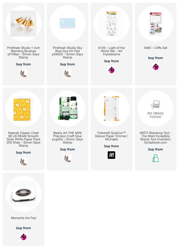
I then added the sky using a blender brush and some light blue ink onto the background. I wanted to make the cliff look more grounded instead of having it float there, so I also added a cliff from the WC Cliffs Set (#5465) and colored that in using the same color combos as before. I then stamped the sentiment. I hope you have a nice week! I will be working on fall projects! 


Materials Used

Stamps
  • 6126 Light of the World
  • 5465 WC Cliffs Set
Markers
     R29, R24, R27, C2, C3, C4, C0, C10, C8, C6, E79, Y35, G29, W1, G24, G28, G94, W0, BG75, BG72, BG70, BG78, E59, E15, E57, E25, G99, E35, W7, W5, W3

 

Sunday, July 26, 2026

A Masculine Watercolor Birthday Card and a Card for a Friend.


Hello Crafty Fiends and Happy Watercolor Weekend!

Today, I want to share two projects that are completely different in purpose.

For the first project, a friend asked me to create a masculine watercolor birthday card for her husband. Knowing he loves the ocean and owns a boat, I designed the card with that theme in mind.


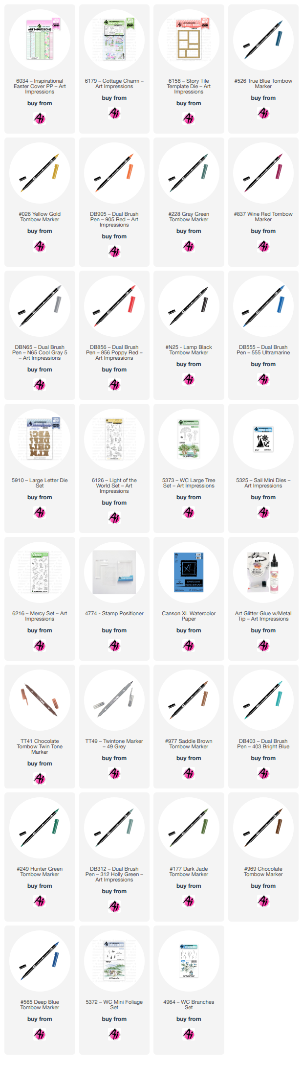
To start, I used the lighthouse and cliff stamps from the Light of the World set (6126). I inked everything except the tree using Tombow markers 969 and 565, and stamped the tree using Tombow marker 177. I then pulled the colors from the stamp and painted the lighthouse and the cliff.


Next, I painted the tree and some background foliage using branches from the Branches Set (4964) and the Large Tree Set (5373). I also added the sky.


To add the ocean, I drew a line and masked the sky to create a straight horizon. I built up the ocean using different shades of blue, and then added a few wave lines using bleed-proof white. I kept it looking like a calm ocean without too much foam or waves.


For the sentiment, I used the Large Letter Die Set (5910) to cut the letters "HPPY" three times—twice in white and once in blue. I layered and glued them together with the blue letters on top. For the letter "A", I used the sailboat from the Sail Mini Dies set (5325). I added a few lines to one of the sails using a red marker (856) and a little gray for shadow. Finally, I added a "Birthday" stamp and cut a coordinating blue mat to be glued around the card.


I am really happy with how this card turned out, and I hope you like it, too!


                                              My second card:  Thinking of You card


I want to share the details of the second card I made. I am making this card for a friend who is going through a difficult time, and I hope it brings a smile to her face and lets her know that I am thinking of and praying for her.

Since she loves birds, I designed this card specifically with her in mind:


  - Background & Stamping: I started by sketching the paper using the die from Story Tile Die Set (#6158) and then stamped the birds from the Mercy Set (#6216). I left one space open for a sentiment from the Cottage Charm Set (#6179). 


- Painting: To give the birds a realistic look, I researched different sparrow species online for reference. Once the painting was dry, I applied a thin layer of Distress Glaze to seal it.    


 - Assembly: I cut the frame twice—once in black and once in kraft paper for the top layer. Finally, I glued the frame and mat together onto a matching kraft-colored card base.


Thank you for taking the time to read my blog. I hope these cards inspire your own creations. Please feel free to reach out if you have any questions.

Happy crafting and watercolor painting!


Saturday, January 24, 2026

A Pocket Full of Sunshine: Creating a Faith‑Inspired Portfolio by Janet

Creative portfolios can feel a little daunting at first, but when you’re working with the right tools, the process becomes pure enjoyment. Art Impressions has a way of turning big ideas into approachable, joyful projects, and this sunshine‑filled portfolio is the perfect example.

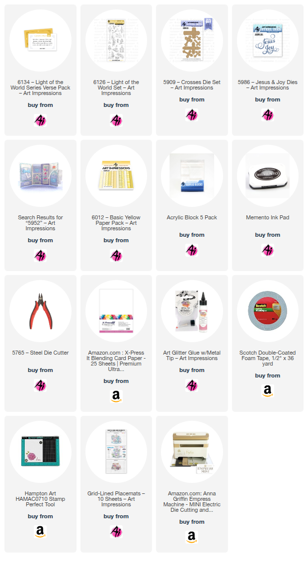
For this piece, I used the 5952 – Portfolio Template Die Set paired with the bright and cheerful 6012 – Basic Yellow Paper Pack. The combination couldn’t be more fitting for the current AI Challenge: A Pocket Full of Sunshine. I also leaned into a religious theme, making this a meaningful way to feature the 6134 – Light of the World Series Verse Pack. 

I began by cutting the portfolio from yellow cardstock and folding it along the score lines. The sunny color instantly set the tone. Using the coordinating dies in the set, I cut additional shapes from the patterned papers in the Basic Yellow pack to layer onto the cover and interior.

To bring in a touch of elegance, I added gold accents using the 5987 – BJ Icon Die Set. These metallic details catch the light beautifully and elevate the entire design.

The front of the portfolio features a small pocket holding two coordinating tags — a sweet little interactive element that adds charm and dimension.

Inside, I decorated the panels with flowers, a Bible, and a lighthouse image, all stamped and colored from the 6126 – Light of the World set. These images pair wonderfully with the verse pack and reinforce the comforting, faith‑centered theme. I closed the center envelope and the portfolio itself with velcro dots. This keeps it secure but opens easily.

On the inside left side, I added another pocket and tag, this time adorned with a delicate cross from the 5909 – Crosses Die Set. For the finishing touch, I included a large gold “Jesus” die cut from the 5986 – Jesus & Joy Dies, which adds a bold and beautiful focal point.

This portfolio came together so smoothly, and the final result brings me both joy and comfort. It’s a bright, faith‑filled piece that feels like a little pocket of sunshine — exactly what the challenge called for.

If you’re looking for a project that blends creativity, meaning, and a touch of sparkle, this one is a wonderful place to start.