Showing posts with label nautical. Show all posts

Sunday, March 1, 2026

March 2026 Monthly Guest Designer Challenge with Debbie Hedges

Hello Ai fans and welcome to our March Monthly Guest Designer Challenge!

As you may have heard...Simone Carr has become our newest Watercolor Design Team Member.

That left an opening for our Monthly Guest Designer Challenge.

We were THRILLED when Debbie Hedges agreed to accept that position!

For her first card, she created a BEAUTIFUL beach themed card,
because, aren't we all ready for a little sunshine?


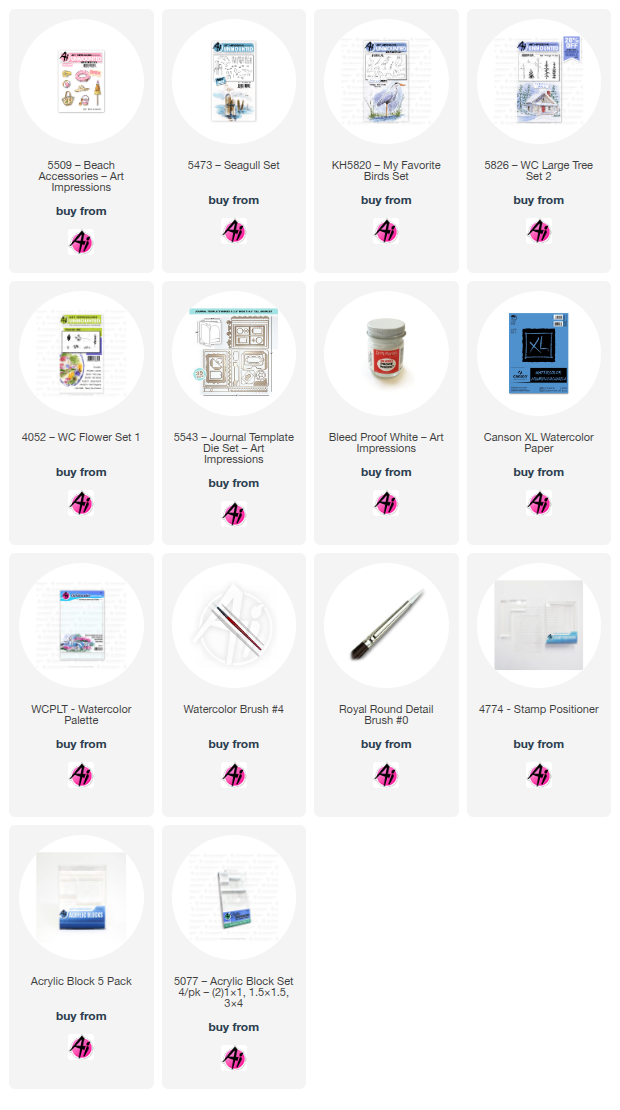
 I feel so honored that Renee offered me the opportunity to be guest designer throughout the year now that Simone has moved to the Design Team. Simone does such an amazing job with her projects! I am a huge fan of Art Impressions and have been for years! I hope I can provide inspiration for you to use these amazing products. For this project, I cut out my rectangle with the die from the #5543 Journal Die set (2.75”x4”). I normally cut the project at the end, but I wanted this project to have a border. I then used my ruler to add a horizon line for the ocean approximately 1.25” from the top of the rectangle. I had stamped and cut masks for the beach ball and the tote bag from #5509 Beach Accessories, so I used them to determine where they should be stamped in the foreground. It helps to figure out placement before you start stamping. Once I had the masks in place, I added the dunes in pencil in the middle and then also drew the shoreline in pencil as a guide. My next step was to stamp the tote bag and beach ball. I started with the tote bag by inking it in #40 Brownish Grey so that I could avoid inking the tropical scene on bag. I then applied the mask and used my positioner to stamp the beach ball in Shadow Grey Archival ink so it looks like it is slightly behind the bag. With my positioner, I then added the seagull – also stamped in Shadow Grey Archival Ink. I still use Marvy Le Plume markers for my projects. Most of these can be converted to Tombow colors, but choose colors that work for you. These just happen to be some of my go-to colors for any project I work on. 

 Here is the link for the Tombow conversion chart.

  https://www.artimpressions.com/shop/art-impressions-most-loved-color-conversion-chart/) 


 I started with the tote bag by pulling out the color along the edges. Then added color using #17 Steel Blue, letting layers dry in between. I added more color along the edges, leaving the center of the tote bag lighter. I then used a mix of #45 Sepia and #86 African Violet to apply color to the handle and the accents on the bag. Marvy Markers have a fine tip, and I used #40 Brownish Grey to add some darker areas on the handle, stitching accents and the buttons. For the beach ball, I used #65 Cherry and #3 Blue. For the white area, I carefully added shadows with the same grey mixture I used for the tote bag. My next step was the ocean. I mixed #14 Turquoise with #17 Steel Blue to soften the color. I started with the horizon line and then filled in the area with horizontal strokes making sure to have light and dark areas for interest. I let layers dry in between. For the sand, I used #30 Rosewood for the area near the shore and #45 Sepia for the dunes and foreground. I added layers along the top of the dunes to define them and the other areas used more of a wash to just show the “idea” of sand. For the grass, I used the grass from #5826 WC Large Tree Set 2, starting at the edge of the project and stamping a couple times down the hill I created. I also placed my mask on the tote bag and stamped the grass along the edge of the project to show the foreground. With Post-it tape, I covered the “sand” and stamped the teeny t iny grass stamp from #4051 WC Foliage Set 1 to add some smaller grass to taper off down the dunes. I wanted some tall grass as well, so I used my positioner and stamped tall grass from #KH5820 My Favorite Birds Set a couple times on each side. All of the grass was stamped with #17 Olive Green. I then used the fine tip on the marker to add some “tufts” on top of some of the tall stems. Using #75 Sky Blue, I added sky. I made sure to apply the color so there were light and dark areas and also some white space to show clouds. With seagulls being white on the underside, I mainly just added grey shadows at the bottom edges of his wings and his tail feathers, along with shadows on his body. I darkened his eye with a Micron pen. I used the fine tip of #43 Brilliant Yellow to add color to his beak. With Dr Ph Martin’s Bleed Proof White, I added waves to my ocean. I also added some dots along the water’s edge to show how the waves can froth as they reach the shoreline. Next to the tote bag, I added some larger white dots for daisies along with some smaller dots as well. When they were dry, I added yellow centers with the fine tip of #43 Brilliant Yellow. With #45 Sepia, I painted an uneven line under the grass, tote bag and beach ball to anchor them in the foreground. I also used the fine tip to add some dots for sand and then signed and dated my project. I hope you’ll give this project a try. The monthly challenge does not have a theme, so please be sure to enter your projects using Art Impressions products for a chance to win! Who doesn’t love a chance to win free stamps??

Now let's see who won our February Challenge!

Our Lucky Random Winner was:

#14 Gabriella B.


Please contact Leah at Feedback@artimpressions.com
to claim a free stamp set of your choice!!

The winner of a freebie from be is #11 Lynn C.


Lynn, please email me at Renee@artimpressions.com
with your full name and address and I'll send you a photo of the freebies I have available for you to choose from.

Now for our new monthly challenge, here are the rules.

 ✻ Please make a new card or handmade crafty creation using either stamps, dies and or designer paper from Art Impressions. You can make any item you wish; this is not limited to cards! (unless specified)

✻ Limit two submissions per person.
One random winner will receive a free stamp set from Art Impressions and one random winner will receive a freebie stamp from me.
 ✻Please include your first name and last initial on your submission. You may include your entire last name, but it's not necessary.
✻We love to comment on your entries, but keep in mind if you use a private group or a platform that you need to sign up for, we probably won't be able to.
✻ The Ai Challenge is open to everyone, international submissions are welcome!
✻ Include a link back to the Ai Blog or grab our button on the top right of our sidebar!
✻ Share the Ai love if you can, by clicking and commenting on your fellow crafters.
✻ Make sure to get your link up by the deadline to enter your creations.
✻ Good luck and happy stamping! 

You are invited to the Inlinkz link party!

Sunday, July 23, 2023

Cabin on a lake by Reneé Matarese

 Hello Ai fans!

Did you check out the current challenge here on the blog?


For 20 years my family and I rented cottages on the lake where my husband grew up.  I've spent many hours (and miles and miles) walking around that lake and putting my toes in the water at the end of the dock.  Sadly, everyone we used to rent from sold their cottages and new owners didn't want to rent.  There are other lakes, but they don't have the same meaning as this one did. It's the end of an era.

My card took me back to the summer before COVID which was the last time we rented. (Just a coincidence)


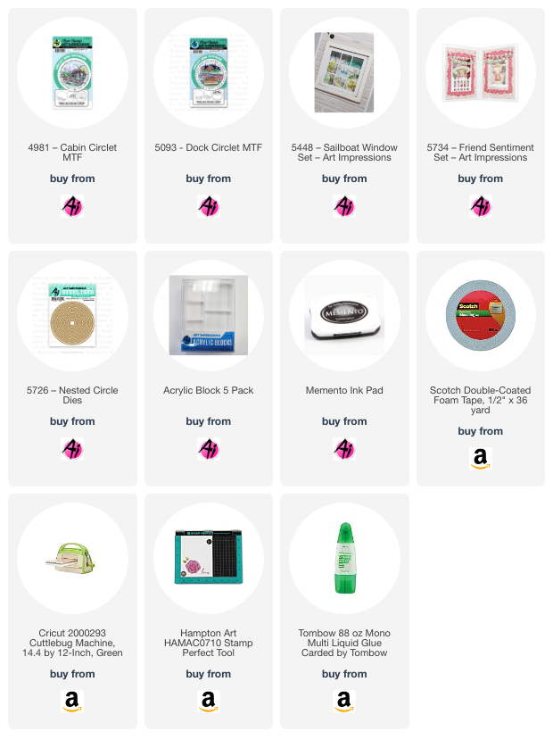
I use the 5726 – Nested Circle Dies to cut a figure 8 shape out of the front panel and then I cut two circles and pieced them together to make a frame for the window.  The sentiments are from 5734 – Friend Sentiment Set.


For the images, I combined three different sets.  I wanted to feel like I was sitting on the dock, watching the sailboats go by and looking at the beautiful cottages across the lake.

4981 – Cabin Circlet MTF
5093 – Dock Circlet MTF
5448 – Sailboat Window Set

You might be thinking,  but Reneé, the Dock Circlet had a cabin in it.  Why did you use the one from the Cabin Circlet?  It's because that one looks much more like the one we used to rent and some others on that lake.


Random fact...it was 5:26 when I glanced at the clock while coloring the sailboat.  Thus, the addition of 526 on the sail.  The ropes/twine were added to give some texture and a bit of a nautical look.


Markers used:
TT Peach Pink
Copics:
N1, T3, E35, E3, E55, YG63, YG67,
 B14, B41, B93, YG00

Saturday, April 16, 2022

Watercolor Weekend 4-16-2022 Happy Easter!

 Hello Ai fans!

It's a Watercolor Weekend at Art Impressions and as always, our Watercolor Design Team has some fabulous work to share with you!


First up we have Dot with an adorable Easter creation!
-----------------------------------------------------------------------------------------------------------

Hello,
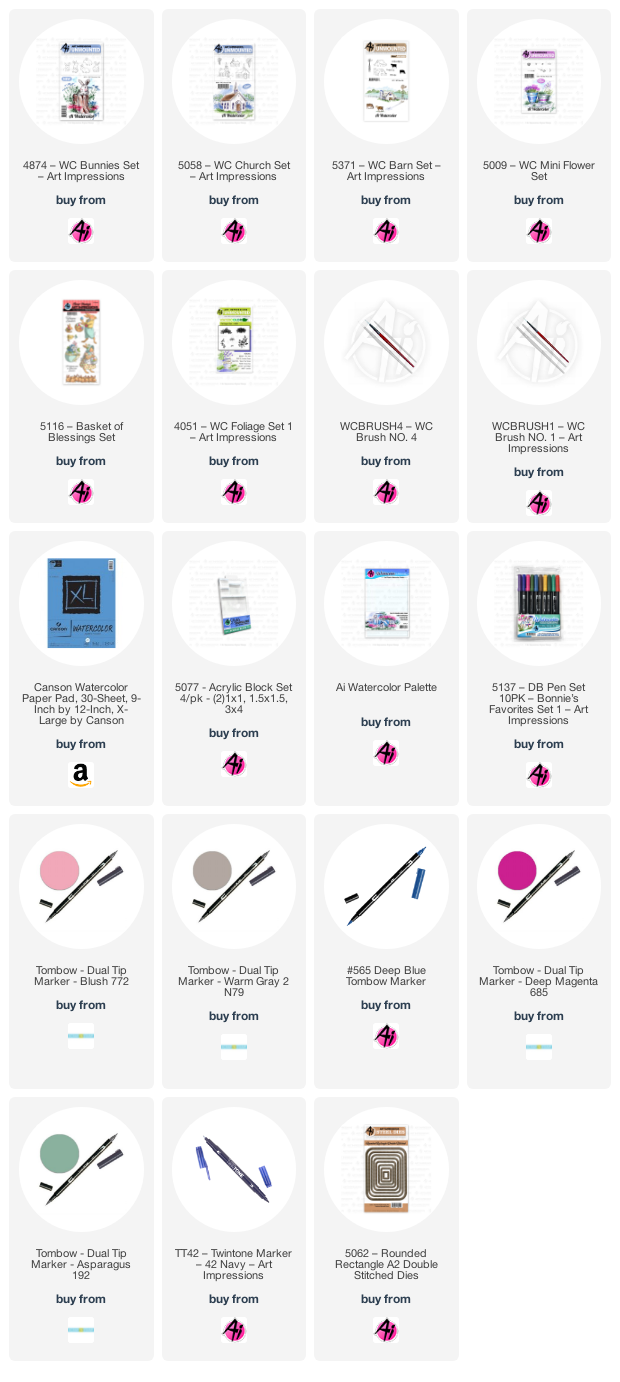
I wanted to make a whimsical bunny couple on their way to Easter services for this last Art Impressions Watercolor Weekend post before Easter. I penciled in the glasses and bow on him (then used a fine tip black pen) and gave her a flower necklace.

To make this, stamp the bunnies from the 4874 Bunnies Set inked in Tombow N79 which is such a great color for animals. Their ears and her cheeks are colored in 772. The flowers around her neck are just the mini dots from the 5009 Mini Flower set inked in 685 and the foliage is also from that same set inked in 192. The little basket is from the 5116 bunny holding the basket but I only inked the basket in the N79. The eggs are colored in with the 192, 685, 772 and 565. I stamped the small grass from 4051 Foliage Set 1 inked in 192 and then used the same colors as the eggs for the small dots to make the flowers. Stamp the small church from the 5058 Church Set inked in N79. Color the roof and door in 192 and use the fine tip of the Tombow TwinTone blue pen to darken the windows. The trees are inked in N79 and are also from the church set. Their leaves are from the 5372 Mini Foliage Set inked in 685. Stamp the fence from the 5371 Barn Set inked in N79. Use the small grass from the Mini Foliage set inked in 192 along the fence and church. Use 192 on the palette to color in the ground. The sentiment is also from the 5116 set. Use the 5062 Rounded Rectangle Die Set to cut out your paper. Hope you all have a wonderful Easter!


Next up is Karen with her spectacular foundations scene!
----------------------------------------------------------------------------------------------------------
I am excited to finally be using 5470 - WC Foundations Rocker for the first time!

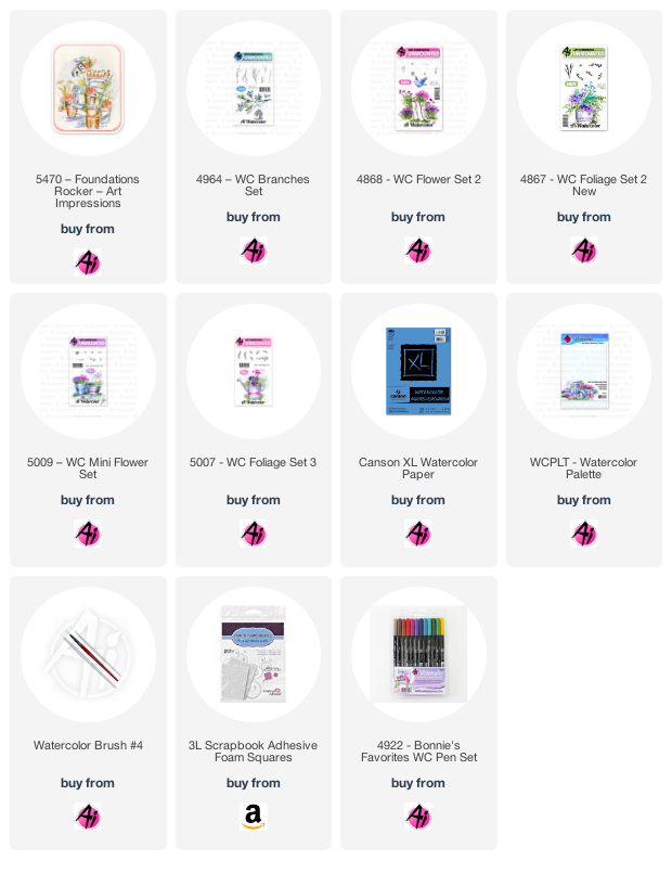
When I use a larger image like this, I like to pick out a limited colour palette ahead of time - and I stick to it.  It ties the scene together, and keeps it from becoming too busy.  For my scene I used these Tombow Dual Brush Markers: 027/N65/126/177/606/493/676.  I do the same thing with the flowers and foliage, repeating the same images in different areas.  Here are the stamp sets that I used: 4867 - WC Foliage Set 2 New/4868 - WC Flower Set 2/5009 - WC Mini Flower Set/5007 - WC Foliage Set 3/4964 - WC Branches Set.

I placed my Foundations stamp into my Misti, coloured it with #027 and stamped it onto some Canson XL Watercolour Paper.  I started with light washes of colour, and gradually built up the layers to achieve the tones that I wanted.  I painted the pots, chair and birdhouses first, and then began filling the pots.  I start with one stamp, and place the image in several pots in the same colour, then move onto the next - making sure to balance out where the colours are, while building my pots.  I added a few branches and dots, and added shadows with 565.


Lastly, we have Tricia's beautiful lighthouse scene in such pretty, nautical colors.
-------------------------------------------------------------------------------------------------------------

Welcome back watercolor fans!  How excited are you for Spring or better yet, Summer 😊 Today I created a quick Lighthouse card for you.  I love the lighthouses because they are great for masculine cards.  Never can have enough ideas for those men in our lives.


Step 1: The Lighthouse

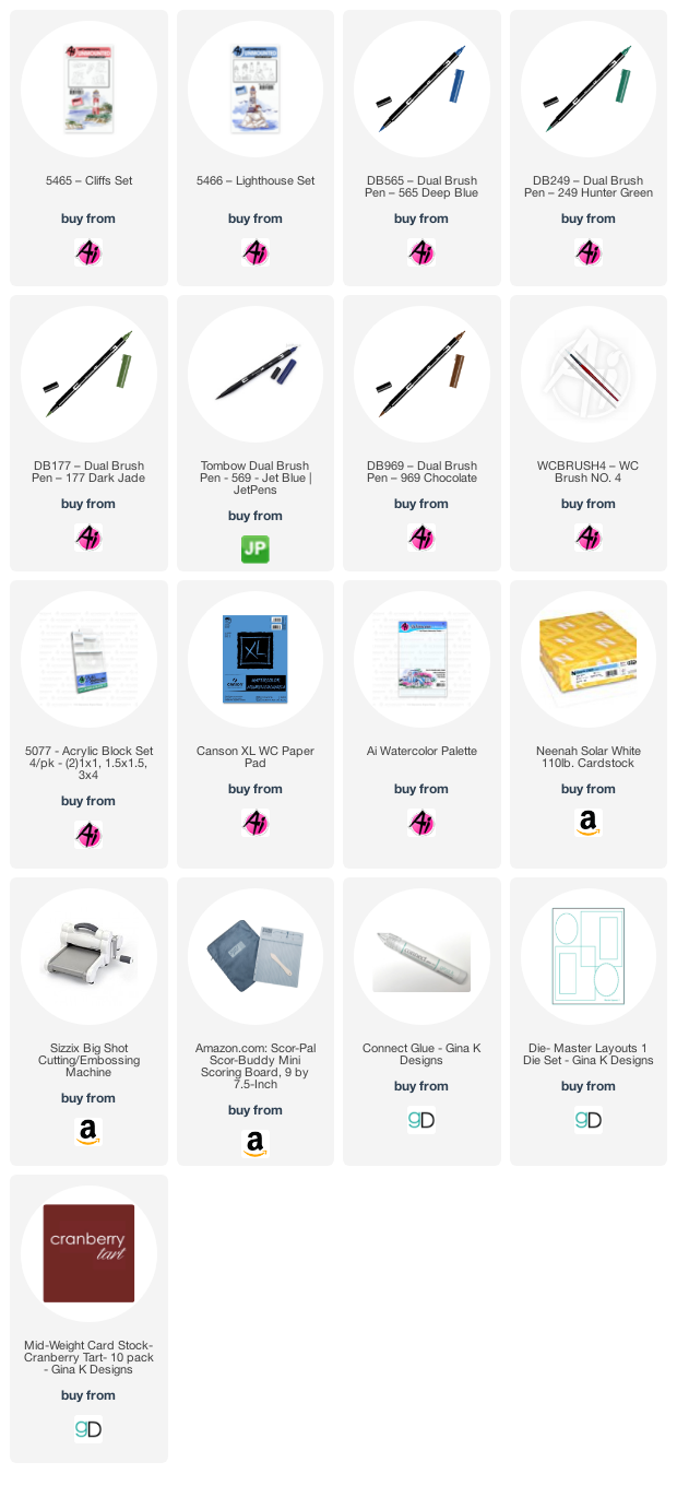
I started out by inking one of the lighthouses from the set with 969.  You can stamp it off if you want a lighter look, but me, I like it dark, so I didn’t stamp it off.  Instead, I pulled some color in from the sides and added some additional color from my palette.  Make sure the right side of all of your objects is darker as the objects are facing the light source.  I added some color to the windows and the house including a bit of red on the roof. 

I stamped it again on a piece of post-it tape to create a mask for when I add the foliage.


Step 2: The Cliffs

For the cliffs, I used one of the bigger cliffs.  First, I inked the entire stamp with 969.  Then I took 569 and added it just to the rocks.  I wanted them to be distinguished from the cliff background.  The stamp I used is clear, so it was really easy to line it up where I wanted it.

I added water to the rocks and sand using my small brush so I could keep it very controlled.  Pull the color out from the lines and add some additional color from your palette where you want things really dark.  These cliffs are so much fun to paint.  By placing dark color under the grass, it gives the cliff a little more definition.


Step 3: The Foliage and grass

I kept this part simple, I started out by laying a small amount of color from my palette to the ground next to the lighthouse keeping the front a bit lighter.  Using the tree line stamp, I inked it with 177 and stamped it several times behind the lighthouse and house to give the look of a forest of trees and then a couple of times in front and to the right of the house.  I added water to the lighter treetops first and then to the darker ones.


Step 4: The Water and Sky

The water is the best part.  I used a larger brush and lots of water and paint from my palette.  There is no wrong way to do water and clouds.  The areas around the rocks should be darker.  To do the sky, you can approach it a couple of ways, you can lay down water and drop in color from your palette or you can add color directly from your palette and then add water to soften.  Paper towels are great for sopping up color and creating cool cloud-like shapes.

Don’t forget to sign and date!


Again, an easy card for any occasion and gender.  Who doesn’t love a lighthouse?  I hope you will give this project a try and I thank you for spending some of your time with me.  Have a crafty day!


There are lots of exciting things happening at Art Impressions right now.  Live classes and the warehouse sale are back,  there are new releases and there are new Spring 2022 freebies!


Happy stamping and Happy Easter!
May you all have a wonderful weekend

Sunday, September 13, 2020

Art Impressions Mini Die Bridge Cards

 Hello Ai fans!

What a fun new release these Mini Dies have been!

I simply can't decide which set is my favorite!

I have 3 cards for you today.


I used 5325 Sail Mini Dies on my first card.


I made a bridge card which was new to me.
I put together a brief tutorial on how I made it.

First, I cut the paper to A2 size vertically...4 1/4" wide x 11". Then I scored across the middle at 5 1/2".  Place the paper into your paper trimmer and cut 1 1/8" in from the right side, down to the score mark.


Flip the paper over and cut at 1 1/8" again, down to the score line.


Turn the paper so that's it's horizontal and then make a cut from the first cut mark to the other one.  Your paper should look like the lower half  of an H.


Once you have your base cut you can cut pieces to fit exactly over the "flap" pieces or that are ever so slightly smaller so you see the base.


I used the 5338 – Baby Mini Dies to create a baby girl card.


The verse is from 5185 – Baby Girl Set.


For my last card I used 5328 – Halloween Mini Dies.


This is the inside.


I cut two bats so that I could pop him up and spread out his wings.


5064 – Circle Double Stitched Dies.

So...are you as obsessed with these new die sets as I am??
I know these will get used CONSTANTLY!!


Copics used:

W5, T4, N1, B34, R37, E33, E42


Sunday, April 28, 2019

My Fortress by Reneé Matarese

Hello Ai fans!

Today I'm sharing one of the Bible Journaling sets from Art Impressions.
This one is called 5069 – My Fortress Set.


I wanted to create a dimensional look to the card so I used a clear front.
For even more dimension some of the elements on the front are popped up on foam tape.


I apologize for the photos. I had trouble with the acetate and even photographing the inside because I had to hold the acetate up to take the pictures.


Here's the full scene on the inside.