Hello, and Welcome to Watercolor Weekend! It’s hard to
believe that I have officially been on the Design Team for 2 years now, and it
has been amazing so far! I can’t wait to
see what comes next!
I am in love with the Flower Foundations, these are soooo
beautiful! Even though they were created for the Holiday Lane Series, they are
great as standalones for cards.

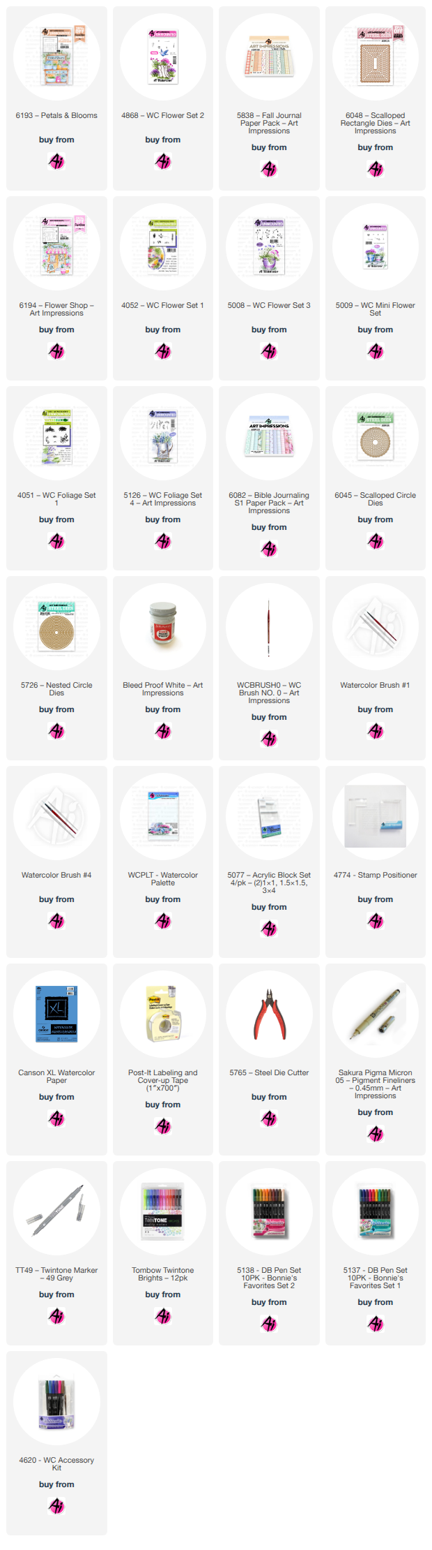
For this card I used 6193 Petals and
Blooms. I started by stamping in
Distress Ink Pumice Stone on my watercolor paper after stamping off once. The main frame of the stand was painted with
228, the rest I used 947. I really love
how this combo turned out! The drawer handles were done in 026, which I feel is
the closest to a gold color in the Tombow line.
For the pots on the counter, going left to right, I created a mask by
stamping on some post-it tape and masked the pots after I had them colored. I shaded the first pot with 565, and then
added lines in with 817. Using the large foliage from 4051 Foliage Set 1, in
126 first using one of the short ends, and then added just a touch of 177. 4868 Flower Set 2 was used to add in the
flowers by just inking the flowers with 025 and then separately with 905 in
just spots for more of a contrast. The 2nd
pot I used 905, 5009 Mini Flower Set in the smaller version that I used on the
first pot in 177 and 526. I shaded the 3rd
pot with 565 first and then added the detail in with 817. 5126 Foliage Set 4,
small vine in 249. The last pot I used 636, and used a stamp positioner to
place in the cat from 5324 MB Cat Accessories. I then masked off the cat and
used 5126 Foliage Set 4, small vine in 126, and a line of 177 up the middle of
the area that I colored with 126. I
stamped this multiple times going up and over the top of the stand, I also
inked the stamp in just 177 and stamped a couple for a darker variation. Going left to right on the bottom shelf, I
also created a mask for these as well. I used 027 on the first pot and then
added dots with the same color, I then took the large foliage again, and using
one of the short sides and did the same thing I did for the pot above, but left
the flowers out. Next, the top pot, I
shaded with 565, and the top rim I used 676.
The bottom pot I also shaded with 565, and used 905 on the bottom
section. I used the small vine in the
combo of 126 and 177, I then decided I actually wanted it darker so I stamped
in some more with just 177. For the last
pot I used 817 and added a darker line just below the top. I inked the daisy
bunch from 4052 Flower Set 1 first in 703, and then only inked 1 flower and the
dots beside it with 725 and stamped that in just a few times. After removing the mask I added the small
vine in 249. I then went in with a damp
brush and softened all of the flowers and foliage, making sure I cleaned off my
brush between colors. I added some
shading with 565 around and under the stand.
I placed my piece in my stamp platform to add in the Petals & Blooms
with 947. Bleed Proof White was used
throughout the scene for the white flowers. I then cut out my image with the 3rd
from largest 6048 Scalloped Rectangle Dies, I also used the next one up to cut
my mat for my image. 5838 Fall Paper
Pack was used to mat my card base to finish off my card.

For my 2nd card I used the 6194 Flower Shop. I
stamped it on my watercolor paper with Distress Ink Pumice Stone after stamping
off once. I started with 312 for the
walls and I also added some brick detail with the same color. A light wash of 312 was also used on the sign
and door, adding a bit of 565 to shade the top of the door. I used a pencil and ruler to put in the grid
panes on the window. 565 and 969 mixed
to shade in the steps with an additional amount of 565 for a little more
shading. 969 was used for all of the wood
trim throughout the scene. For the glass
on the lantern I used 526 and shaded a bit with 565. I also used 526 on the window, adding in a
bit of 177, 025, 725, and shaded with 565. I finished off the lantern with N15,
making sure I left a highlight in the middle.
For the door knob I used 026, and shaded just the bottom portion with a
little bit of 947. I masked around the top
of the canopy with post-it tape and used the daisy bunch from 4052 Flower Set 1
with 817, stamping multiple times to get a variation, I blended these out with
a damp brush and spreading the color out a bit.
I shaded the top and sides with 565.
I also added 817 to every other sections of the overhang, and shaded the
ones left white with a bit of 565. For
the sprig on the door I used 5008 Flower Set 3, and a stamp positioner, inking
just one of the flowers with 676 and a touch of 636, stamping several times
with the aid of the positioner to get the flowers where I wanted them. I then
took the foliage from 5009 Mini Flower Set in 177, and using the positioner
again stamped it twice. Using my brush
and 177 I added two little ribbons hanging down. For the hanging pot, I shaded with 565 first
and then added details in with 817.
Using the vine from 5126 Foliage set 4, I inked it first in 126 and
added a line up through the stamp with 177, stamping multiple times before
re-inking the stamp. For the top of the
building I started with 5126 Foliage Set 4, using the leafy branch with the
same combo of 126 and 177. Stamping it a
couple of times overhanging both sides.
I then masked off the sign and used the vine from 4051 Foliage Set 1,
again using the same combo. For the pot
on the far right I used 947 and used 4051 Foliage Set 1, using the large
foliage I inked first with 126 on one of the short sides, and then went back in
inking just a very small section with 177 to add a bit of depth. For the pot next to it, I used 565 to shade
the pot first and then added in details with 905. I then masked off the pot to stamp in the
same flowers I used on the door, in the same colors, I then removed the mask
and used the small vine from 5126 Foliage Set 4 in 249. For the pot on the far left, I shaded with
565 on the top rim and used 676 on the bottom also using this color for the
details. I masked off the edge of the
open sign with post-it tape and used the small vine from 5126 in the 126, 177
combo. I then put my project in my
stamping platform to add in the Flower Shop in 312, and the Now Open in 177. A helpful tip if you need it, I use a piece
of acetate to cover my project and stamp on this first before committing to the
placement. It allows for you to see how
it looks before stamping on your project and lets you adjust if need be. I then used Bleed Proof White to add in all
of the white flowers. I decided I wanted
to add some color to this so I used 676, 026, 725, 526, and 565, using a
different color for each set of flowers.
I cut out my image with a circle die from my stash, and matted this with
purple cardstock cut out with the largest die of the 6045 Scalloped Circle
Dies. I matted my card base with paper
from 6082 Bible Journaling S1 Paper Pack, completing my card. Thank you for joining me today, I hope you enjoyed my projects. Until next time! Create....Share....Inspire!